
Introduction
Warm neutral kitchens never go out of style — and that is precisely the point. While bold color trends come and go with every design season, a beautifully chosen warm neutral kitchen palette stays effortlessly current, endlessly adaptable, and genuinely welcoming in every light condition throughout every hour of the day. Whether you are planning a full renovation or simply repainting cabinets, these 21 colors prove that warm neutrals are never the safe choice — they are the smartest one you will ever make.
1. Creamy White Cabinets With Warm Undertones
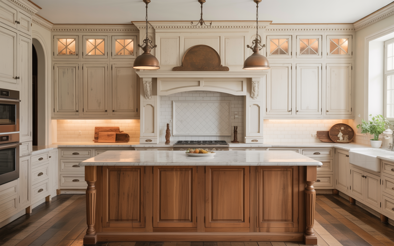
Creamy white is the foundational color of every warm neutral kitchen palette — the tone that delivers everything brilliant white promises while avoiding the cold, clinical quality that pure white introduces in kitchen spaces lacking abundant natural light. The warmth in creamy white comes from subtle yellow or ivory undertones that pick up the warmth of natural materials — wood, stone, brass, and linen — and reflect it back into the space with a gentle amplification that makes the kitchen feel permanently bathed in soft, flattering light. Benjamin Moore “White Dove” and Sherwin-Williams “Alabaster” are the most consistently beloved creamy white cabinet colors in professional kitchen design.
Unlacquered brass hardware is the critical companion detail that makes creamy white cabinets achieve their maximum warmth and sophistication in a warm neutral kitchen — the warm golden tones of brass pick up the ivory undertones of the cabinet paint and amplify them into a consistent warmth that runs through every cabinet face across the entire kitchen. Unlike polished brass, unlacquered brass develops a natural patina over time — darkening slightly in areas of regular contact, maintaining its golden warmth in protected areas — creating a living, evolving hardware finish that makes the kitchen appear more established and authentic with every year of daily occupation rather than simply new and temporarily fresh.
2. Soft Butter Yellow Lower Cabinets
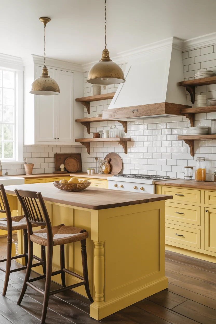
Soft butter yellow lower cabinets represent the most warmly cheerful entry point into warm neutral kitchen color territory — a yellow so muted and creamy that it reads as a warm neutral in most lighting conditions rather than a committed color statement, yet carries enough tonal warmth to transform a kitchen from simply light into genuinely sunny and joyful. The key is choosing a butter yellow with significant gray or beige mixed into its base rather than a pure, clean yellow — this graying down of the tone is what shifts the color from primary cheerfulness into the sophisticated, livable warmth of a true neutral.
The two-tone treatment — butter yellow below, crisp white above — is the composition that allows yellow to function as a warm neutral kitchen color rather than an accent, providing color below the countertop line where it creates visual warmth without overwhelming the space, while the white upper cabinets maintain the brightness and visual height that kitchen spaces need to feel open and generous. The eye-level expanse of white keeps the kitchen feeling airy while the yellow below creates the warmth and individuality that white alone cannot provide. This combination suits farmhouse, cottage, and traditional kitchen styles with extraordinary natural ease and consistency.
3. Warm Greige Cabinets Throughout
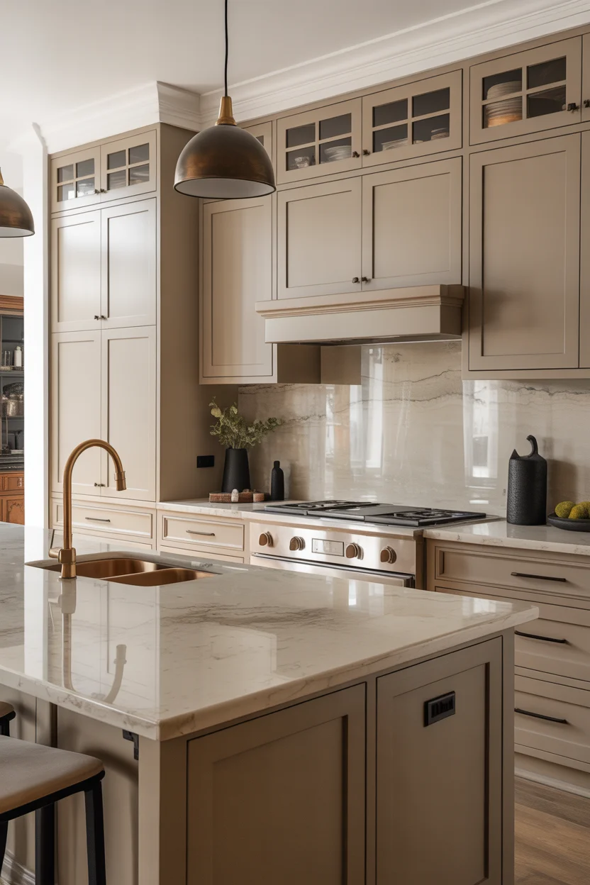
Warm greige is the ultimate warm neutral kitchen color for homeowners wanting sophistication without strong color commitment — a tone of remarkable versatility that reads differently in different lighting conditions, appearing slightly more beige in warm afternoon light and slightly more gray in cool morning light, always remaining beautiful and never overstaying its visual welcome. This chameleon quality is precisely what makes greige the most universally applicable of all kitchen cabinet colors — it harmonizes with warm wood tones, cool stone surfaces, brass and black hardware, and virtually every backsplash material without creating any color conflicts or requiring careful palette coordination throughout.
The leathered stone countertop surface is the material pairing that brings greige cabinets to their maximum sophistication in a warm neutral kitchen — the matte, slightly textured surface of leathered quartzite or leathered granite has a tactile, organic quality that polished stone lacks, and its warm cream-and-gray tonal range mirrors the greige cabinet color with a natural material coherence that makes the kitchen feel completely resolved. Matte black hardware against warm greige creates the contemporary graphic contrast that keeps this palette from feeling too safe or predictable — the black anchoring the composition with bold precision while the warm greige maintains the kitchen’s fundamental warmth and genuine daily welcome.
4. Warm Taupe Island Against White Perimeter
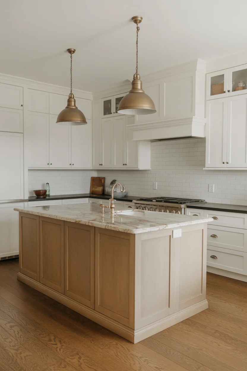
The warm taupe contrast island against white perimeter cabinets is the warm neutral kitchen design approach delivering the maximum visual interest and compositional depth while using only two colors both firmly within the neutral spectrum — no bold accent color required, no design risk involved, yet the result is a kitchen that looks professionally designed and thoughtfully considered rather than defaulted to all-white simplicity. The island’s taupe color creates a furniture-like anchor at the kitchen’s center that draws the eye, defines the social gathering zone, and creates the visual hierarchy that makes a kitchen feel architecturally organized rather than simply filled with cabinetry.
The specific quality of warm taupe — a brown-beige with subtle gray undertones — is what makes it the ideal contrasting island color in a warm neutral kitchen. It is warm enough to create genuine contrast with the white perimeter cabinets without appearing cold or jarring, and sophisticated enough to avoid the slightly dated quality that bolder island accent colors can develop as design trends shift. The thick honed marble countertop on the island — its warm ivory tones bridging the white perimeter cabinets and the taupe island body — creates a material continuity that makes the two-color palette read as a single designed decision rather than two separate color choices awkwardly cohabiting within the same kitchen space.
Visit more:Blog
5. Warm Sand Kitchen With Terracotta Accents
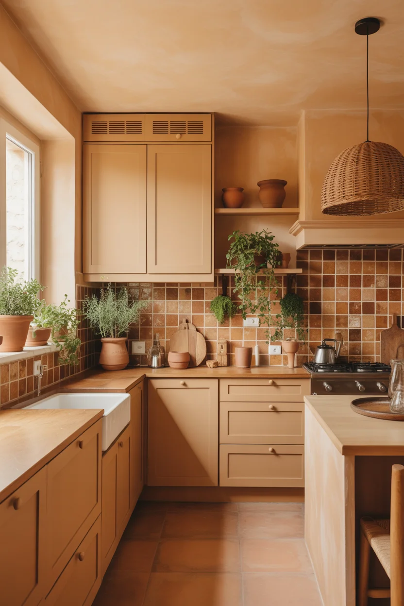
A warm sand tonal kitchen — cabinets, walls, and ceiling all in closely related sandy beige shades — represents the most immersive approach to warm neutral kitchen design, creating a space where color becomes environment rather than accent or contrast. The monochromatic treatment eliminates visual interruption, allowing the eye to move smoothly through the space and experience its architectural qualities — proportions, light, material texture — without being redirected by color contrasts. In this context, the terracotta tile backsplash reads not as a contrasting accent but as a deepening of the sandy palette into its most saturated, sun-baked expression.
Woven rattan pendant lights are the perfect luminaire choice for this warm neutral kitchen sand and terracotta palette — the natural grass weave of quality rattan has an earthy, textural warmth that references the same sun-baked, natural-material world as the terracotta tiles and sandy paint, and the warm amber light filtering through woven rattan creates a particularly flattering and atmospheric illumination quality within the kitchen. The filtered light adds another layer of warmth to the already golden palette and creates the dappled, organic lighting effect that makes this kitchen feel like a genuinely Mediterranean cooking environment rather than a styled domestic interior.
6. Warm Putty Cabinets With Exposed Timber Beams
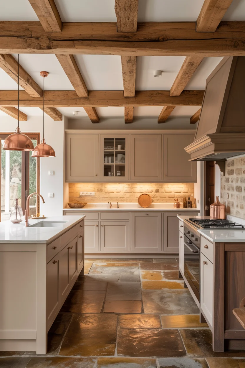
Warm putty is the warm neutral kitchen cabinet color occupying the most interesting and nuanced position in the warm neutral spectrum — it carries enough gray to read as sophisticated and contemporary, enough beige to remain genuinely warm, and enough muting to avoid the slightly predictable quality of more commonly seen greige tones. Putty has a chalky, slightly mineral quality that gives painted cabinet surfaces a depth and seriousness that brighter, cleaner neutral colors lack — it looks as though the color has been in the room for years rather than applied last season, which is precisely the quality that gives kitchen interiors genuine character and timeless appeal.
Exposed rough-hewn timber ceiling beams create the single most powerful material contrast available in a warm neutral kitchen — the raw, structural, organic quality of natural wood beams above the refined, painted cabinet surfaces below creates a vertical material dialogue of extraordinary richness and warmth. The honey-oak tone of the beams amplifies the warmth of the putty cabinets below while introducing natural texture, historical depth, and the irreplaceable authenticity of genuine structural timber. Copper pendant lights hung from the beams carry the warm metallic register of the palette through to the lighting elements, creating a complete material story of warmth, texture, and refined rusticity.
7. Sandy Beige Cabinets With Travertine Countertops
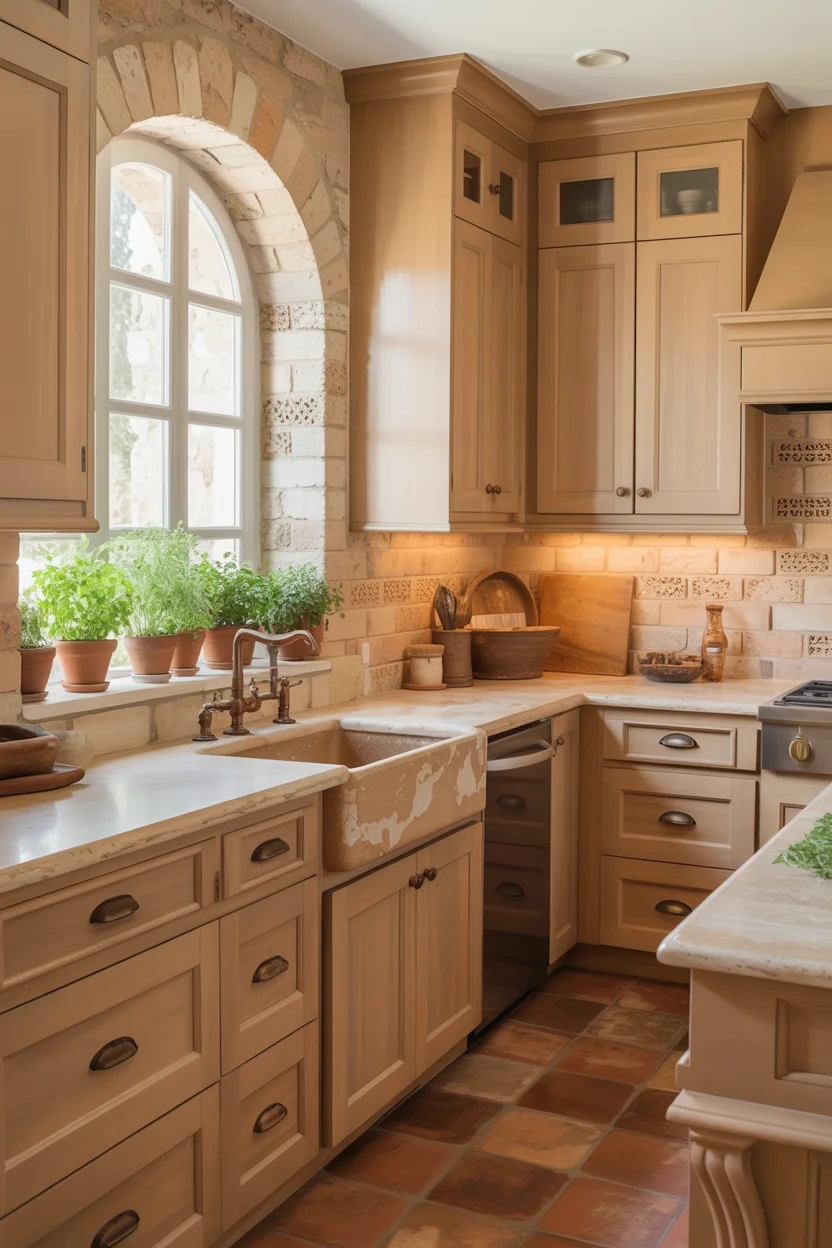
Sandy beige cabinets in a Mediterranean-influenced kitchen create a warm neutral kitchen palette of extraordinary natural cohesion — the sandy tone references the color of limestone, travertine, sandstone, and other warm-toned natural building materials used throughout Southern European domestic architecture, creating a kitchen that feels as though it grew from its materials rather than being assembled from a manufacturer’s color chart. The specific quality of a good sandy beige — warm, slightly golden, and containing enough depth to avoid appearing pale or washed out — creates a cabinet color that looks more expensive than its neutral status might initially suggest to an untrained eye.
Honed travertine countertops are the natural stone companion for sandy beige cabinets creating the most seamless and tonally harmonious material palette in this warm neutral kitchen category — both materials share the same warm limestone-derived color family, the same slightly irregular surface character, and the same Mediterranean architectural heritage. The characteristic natural pitting of travertine — either left open or filled depending on the honed finish chosen — creates a surface texture that complements the slightly aged, tactile quality of well-painted shaker cabinets and prevents the kitchen from feeling overly sleek or contemporary. Bronze hardware carries the warm metallic register of the palette through to every functional detail beautifully.
8. Warm Mushroom Gray Lower Cabinets
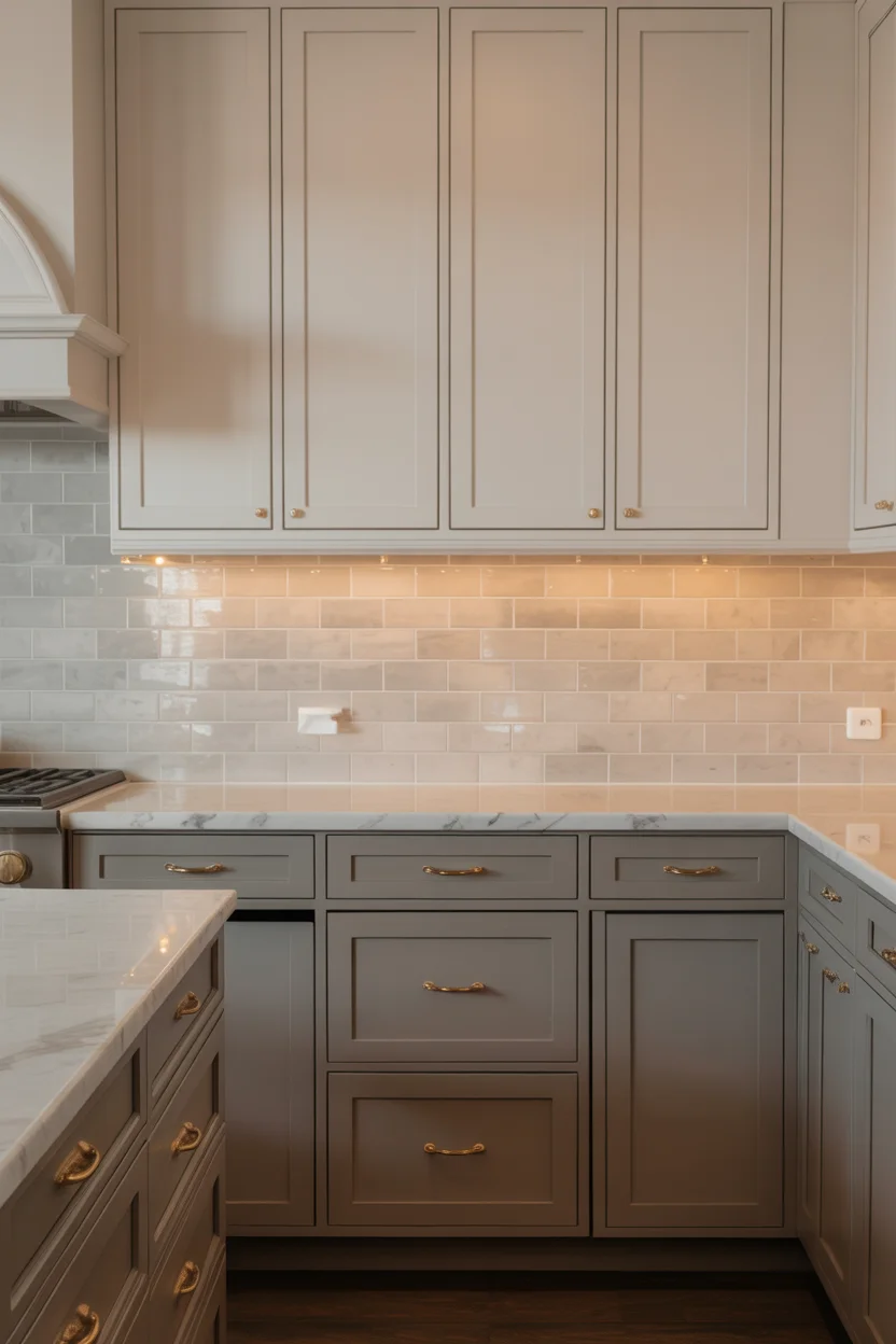
Warm mushroom gray is the warm neutral kitchen color occupying the most sophisticated and nuanced position in the gray-brown-beige spectrum — it carries enough gray to read as genuinely contemporary and refined, enough brown to maintain warmth preventing it from feeling cold or industrial, and enough muting and complexity to avoid the predictable quality that simpler greige tones sometimes project. The mushroom quality — that particular earthy, organic warmth referenced in the name — gives this color a natural-world connection making it feel grounded and calm rather than designed and deliberate, which is precisely the quality that the best kitchen colors possess.
Brushed gold hardware is the warm metallic finish working most harmoniously with warm mushroom gray cabinets in a warm neutral kitchen — it neither disappears into the cabinet color as unlacquered brass sometimes can, nor creates the cold contrast that polished chrome or matte black produces against this particular warm-gray tone. The brushed finish creates a soft, diffused metallic warmth rather than the reflective brightness of polished gold, allowing the hardware to contribute warmth and visual interest without dominating the cabinet face. Under-cabinet lighting in warm amber tones extends this warmth across the countertop surface and completes the layered, cozy quality that makes this palette so thoroughly inviting.
9. Warm Ivory Shaker Cabinets With Aged Brass
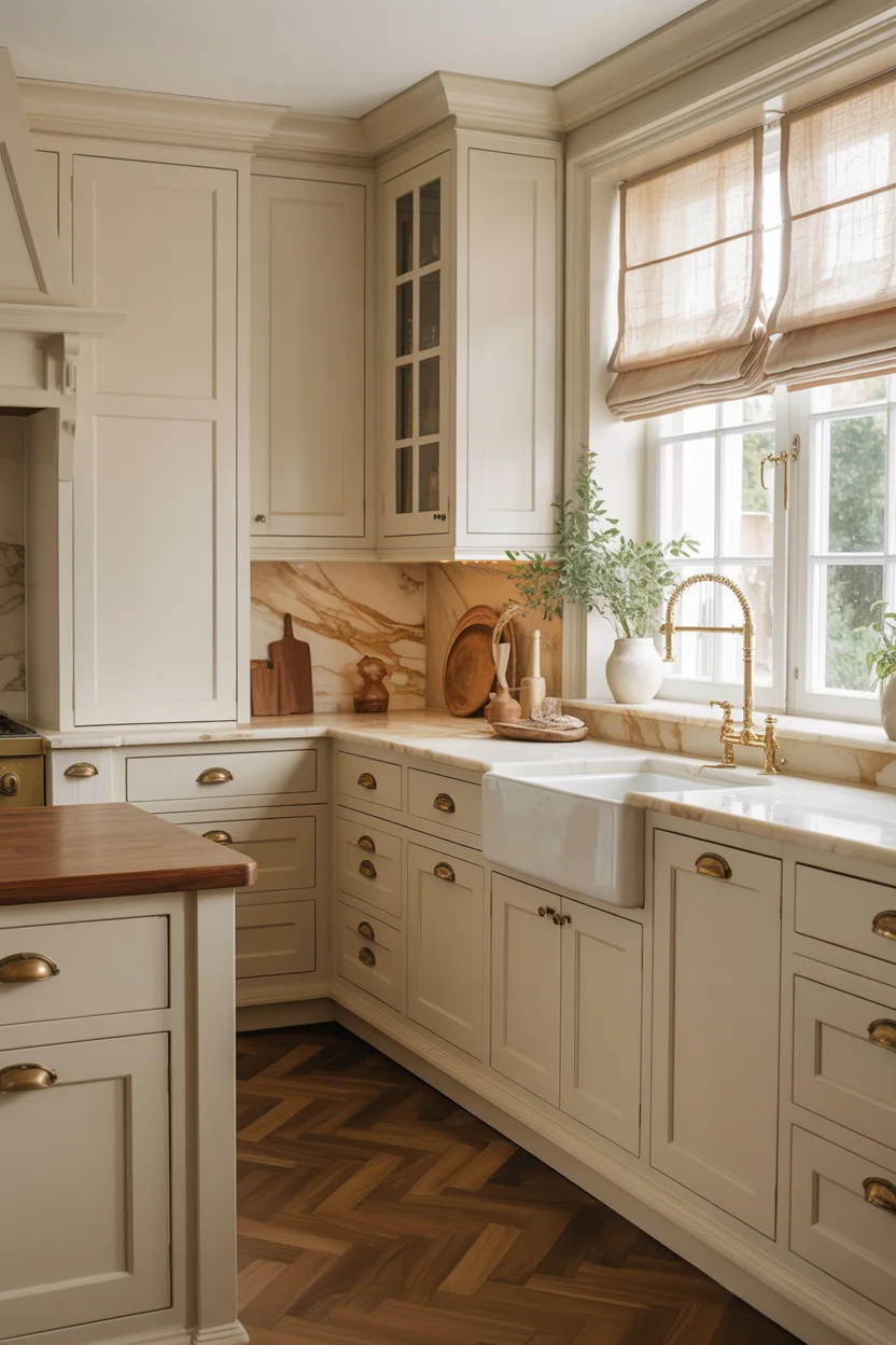
Warm ivory shaker cabinets represent the most deeply warm white possible in the warm neutral kitchen palette — a tone so saturated with golden warmth that it sits distinctly between cream and yellow while belonging fully to neither category. Ivory carries a richness and depth that lighter creamy whites cannot approach, and in kitchen settings with warm light sources — south-facing windows, warm bulb temperatures, or amber pendant shades — ivory cabinets take on a luminous, golden quality making the kitchen feel genuinely luxurious and beautiful. The shaker door profile suits ivory particularly well because the panel recesses create shadows emphasizing the depth and richness of the warm tone.
Aged brass hardware — darker and more complex in tone than polished or unlacquered brass, with the slightly mottled, lived-in quality of genuine age rather than newness — is the hardware finish completing this warm neutral kitchen palette with maximum historical depth and material authenticity. Aged brass references centuries of domestic hardware tradition, creating a kitchen feeling established and timeless rather than recently installed and currently trendy. The thick marble countertop with warm honey veining bridges the ivory cabinet tone and the aged brass hardware in a single material of extraordinary natural beauty — its warm gold veins picking up the brass tones, its pale cream ground picking up the ivory cabinet color beautifully.
10. Warm Oat Cabinets With Raw Oak Open Shelving
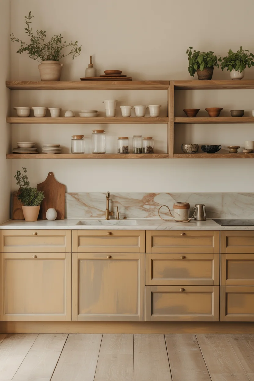
Warm oat is the warm neutral kitchen color most thoroughly capturing contemporary Scandinavian kitchen design sensibility — a tone so perfectly calibrated between off-white and beige that it contains the warmth of natural materials without the commitment of a definite color, creating a kitchen backdrop of extraordinary quietness and natural beauty. The oat quality — slightly golden, slightly grainy in its visual character — references the natural colors of linen, undyed wool, raw cotton, and unfinished wood, connecting the painted cabinet surface to the world of natural fibers and organic materials that defines Nordic interior aesthetics at its most refined and enduringly beautiful level.
Raw oak open shelving against warm oat lower cabinets creates the material contrast making this warm neutral kitchen palette genuinely interesting rather than simply quiet — the natural wood grain of unfinished or lightly oiled oak provides texture, organic warmth, and a living material presence that painted cabinet surfaces cannot possess on their own. The shelving also serves an important functional display role, allowing the kitchen’s everyday objects — white ceramics, glass jars, cast iron, and terracotta — to become part of the visual composition rather than being hidden behind closed cabinet doors. Wide-plank natural oak flooring carries the wood material through to the ground plane, creating a complete palette of warmth and natural material beauty.
11. Warm Vanilla White With Natural Linen Details
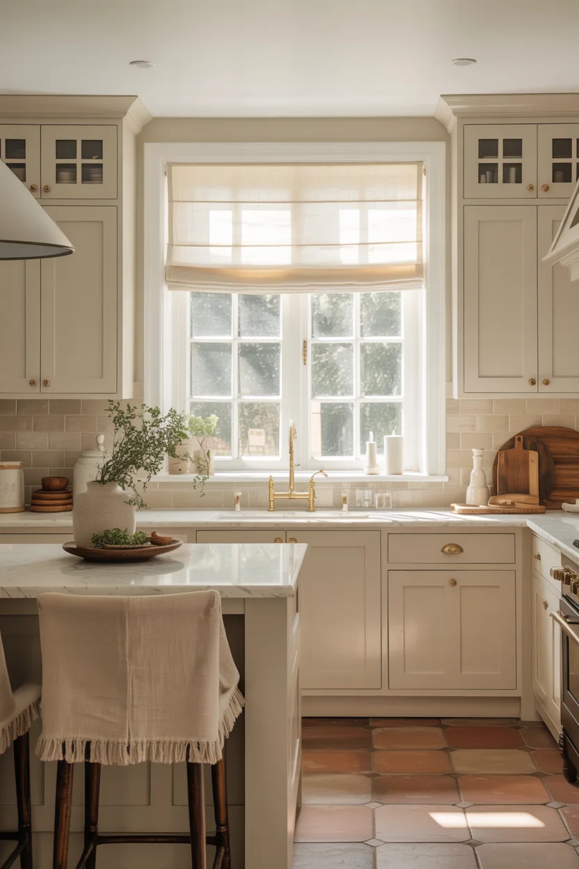
Warm vanilla white is the gentlest and most tender of all warm neutral kitchen colors — a tone so softly warm that it requires careful observation to distinguish from a cooler off-white, yet whose warmth registers immediately and consistently in the overall atmosphere it creates. Vanilla white has a quality of softness that creamy or ivory whites lack — it does not announce itself as definitively warm in the way that stronger ivory tones do, instead creating a pervasive, enveloping quality of warmth seeming to come from the whole room rather than from any specific surface. This diffused warmth is what makes vanilla white kitchens feel so naturally welcoming and genuinely restful.
Natural linen details — barstools upholstered in undyed linen, Roman blinds in natural linen fabric, linen-textured ceramic backsplash tiles — introduce a material layer of organic, tactile warmth that painted surfaces alone cannot provide and that perfectly complements vanilla white’s gentle warmth with natural fiber depth and texture in this warm neutral kitchen. The linen palette — warm beige-cream with natural gray undertones — sits within the vanilla white’s color family while providing enough material contrast and textural variety to prevent the kitchen from feeling monochromatic or overly quiet. For a kitchen of complete sensory gentleness and feminine refinement, the vanilla white and natural linen combination is one of the most beautiful and harmonious palettes imaginable.
12. Warm Khaki Green Cabinets
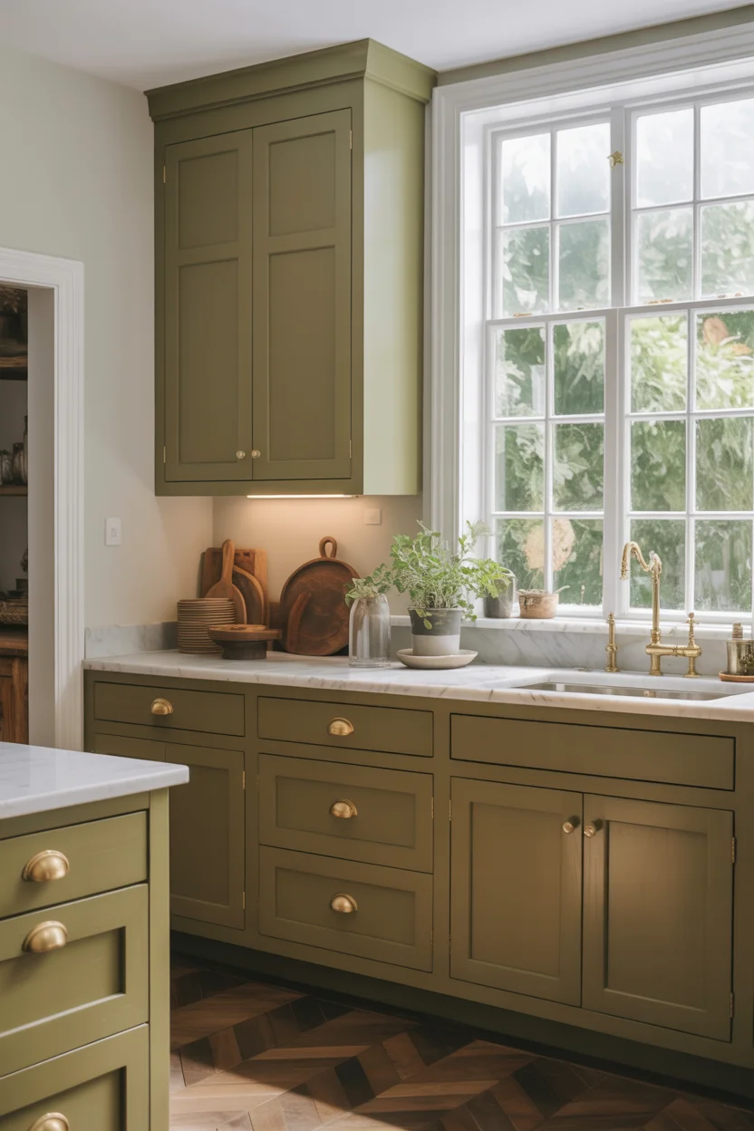
Warm khaki green sits precisely at the boundary between committed color and sophisticated neutral in the warm neutral kitchen palette — containing enough green to read as a genuinely colored cabinet choice, but sufficiently muted with brown and gray undertones that it functions within a neutral palette rather than demanding the design accommodations that stronger greens require. The khaki quality — that particular earthy, military-heritage green associated with natural undyed cotton fabric — gives this color a worldly, understated confidence making kitchen cabinets painted in this tone appear to belong to a homeowner with genuine design knowledge rather than simply good taste.
The relationship between khaki green cabinets and white marble countertops creates one of the most satisfying material pairings in contemporary warm neutral kitchen design — the white marble’s pale, luminous surface bouncing light back into the kitchen and preventing the muted green cabinets from making the space feel dark, while the green cabinets provide the visual grounding and color interest that all-white kitchens with white marble countertops sometimes lack in terms of warmth and genuine personality. Garden views framed by a large kitchen window echo the khaki green cabinet color with the actual green of growing plants and lawn beyond the glass, creating the indoor-outdoor color continuity that makes kitchens feel genuinely connected to their natural landscape surroundings.
13. Warm Biscuit Cabinets With Handmade Tile Backsplash
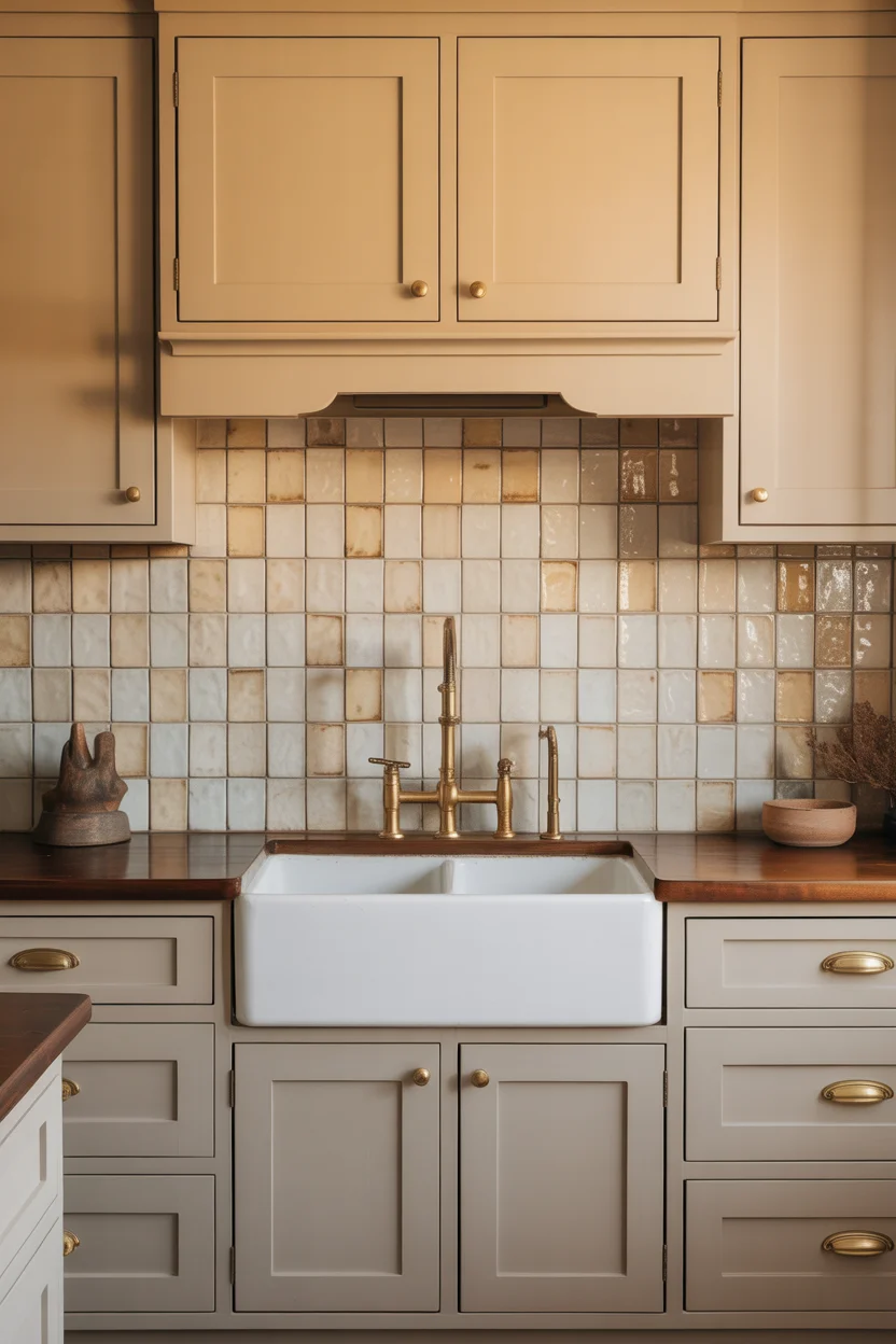
Biscuit is one of the warmest and most deeply golden tones in the warm neutral kitchen palette — a beige so saturated with warmth that it approaches the amber-orange territory of fired clay and toasted grain, creating a cabinet color of unusual richness and depth reading as actively warm rather than simply neutral. The biscuit tone has a quality of culinary warmth — it references the color of baked pastry, golden bread, and warm kitchen surfaces in the most literal and instinctive way, creating a visual environment communicating the pleasure and warmth of cooking and eating with remarkable immediacy and genuine sensory richness.
The handmade ceramic tile backsplash is the material pairing bringing biscuit cabinets to their highest expression in this warm neutral kitchen — the slight surface variations of individually hand-glazed tiles, each one marginally different in glaze depth, surface texture, and light response from its neighbors, creates a backsplash of extraordinary visual interest and artisanal warmth that factory-made tiles cannot approach regardless of their glaze quality or color accuracy. Against biscuit cabinets, an off-white handmade tile backsplash creates just enough tonal contrast to define the material boundary without disrupting the kitchen’s fundamental warmth. This combination consistently produces results of outstanding beauty and artisanal character.
14. Warm Parchment Wall Color With White Cabinets
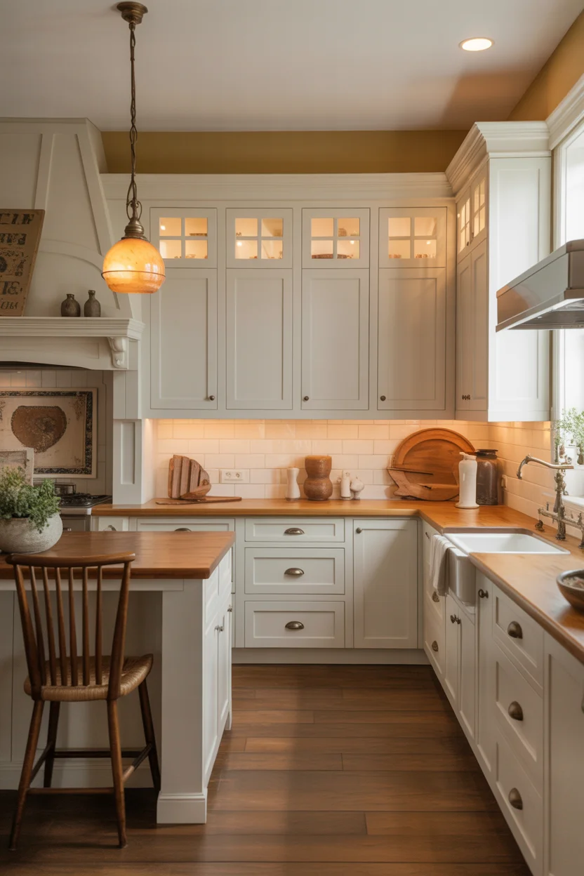
Painting kitchen walls in warm parchment while keeping cabinets white is the warm neutral kitchen approach creating the most warmth with the least commitment — the white cabinets maintain their clean, bright character while the warm parchment wall color transforms the spaces between and above the upper cabinets, below the base cabinets, and within any open shelving zones into a warm, enveloping background making the entire kitchen feel significantly more welcoming and characterful than the same white cabinets against white walls would achieve. The parchment also makes the white cabinets appear crisper and more defined by creating warm-toned contrast behind them.
The specific quality of a good parchment wall color — warm yellow-beige with vintage paper undertones and just enough gray to avoid reading as yellow paint — is what makes this warm neutral kitchen approach so successful across many different kitchen styles and configurations. Parchment is sophisticated enough to suit contemporary and transitional kitchens, warm enough for farmhouse and cottage styles, and sufficiently historical in its color references to feel completely appropriate in period or traditional kitchen settings. Natural wood open shelving against parchment walls creates the warmth-on-warmth layering that makes the kitchen feel genuinely rich rather than simply light, and aged brass pendant lights complete the vintage warmth with a metallic note of perfect period authenticity.
15. Warm Nutmeg Painted Cabinets Throughout
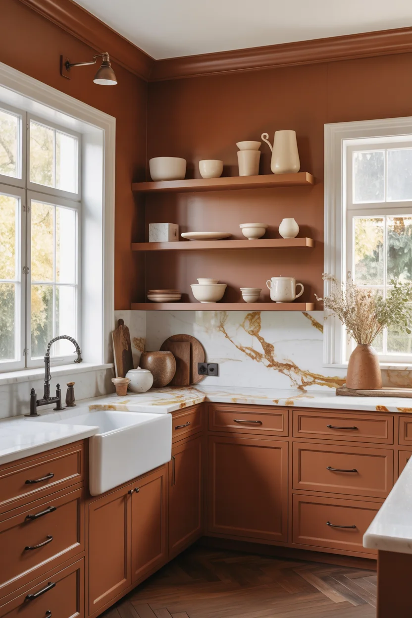
Warm nutmeg represents the most deeply saturated point in the warm neutral kitchen palette — a rich, spiced brown-orange carrying the warmth of cloves, cinnamon, and baked spices in a paint color of extraordinary depth and sensory richness. At this level of saturation, nutmeg sits at the edge of warm neutral territory — darker and more committed than most of the colors on this list — but its brown base and gray undertones keep it firmly within the neutral family rather than pushing it into the territory of bold accent colors demanding specific palette accommodation. In a kitchen with abundant natural light, nutmeg cabinets achieve a warmth of genuinely stunning visual power.
The design intelligence required to use warm nutmeg successfully in a warm neutral kitchen lies in the brightness management of the surrounding surfaces — the cabinets’ rich depth requires white or very light countertops, ceilings, and walls to maintain the kitchen’s overall sense of brightness and prevent the space from feeling dim or heavy. White marble countertops with warm gold veining create the ideal countertop companion — their pale, luminous surface bounces maximum light back into the kitchen while their warm gold veining maintains color family coherence with the nutmeg cabinet tone. Large windows providing generous natural light are essentially mandatory for this kitchen color choice to achieve its spectacular potential rather than simply making the space feel dark.
16. Soft Caramel Island in White Kitchen
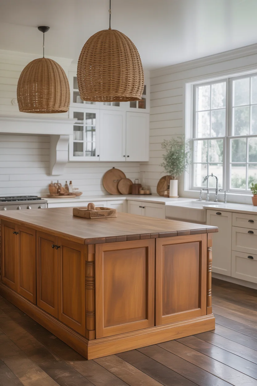
A soft caramel contrast island in an otherwise white kitchen is the warm neutral kitchen idea creating the most immediate and instinctive warmth response — caramel is the color of warm, melted sugar, golden honey, and amber autumn light, and its application to a kitchen island creates a focal point with an almost food-like quality of warmth and richness making the kitchen feel immediately, physically inviting in a way that cooler or more architectural colors cannot approach. The island’s central position in the kitchen gives the caramel color maximum visibility and impact from every angle of the space simultaneously.
A butcher block countertop on the caramel island is the material pairing most perfectly completing this warm neutral kitchen centerpiece — the warm oak tones of quality butcher block sit within the caramel’s amber-brown color family with complete material harmony, and the natural wood grain introduces an organic, tactile quality that the painted cabinet surface below benefits from enormously. Woven rattan pendant lights in coordinating warm caramel tones extend the island’s warm color upward into the ceiling zone, creating a complete column of warmth anchoring the kitchen’s vertical space as effectively as the island anchors the horizontal floor plan. White shiplap walls provide the crisp backdrop making every element of this warm focal point genuinely glow.
17. Warm Gray-Beige With Walnut Accents
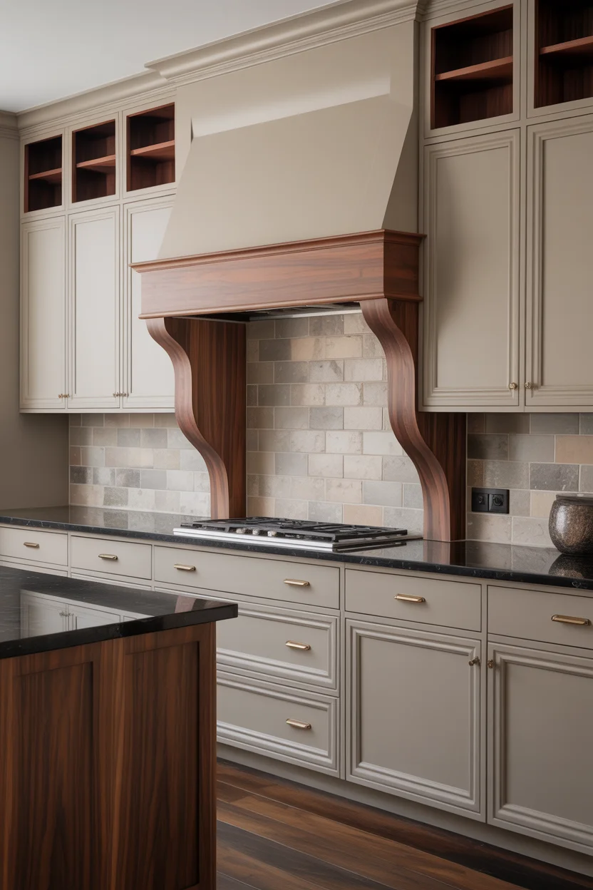
Warm gray-beige paired with rich walnut wood accents is the warm neutral kitchen combination creating the most architecturally serious and design-forward result in this entire collection — the balance of cool gray-beige and warm brown walnut creates a material dialogue referencing the most sophisticated contemporary kitchen design traditions in European and American design practice. The warm gray-beige tone provides a refined, restrained background of considerable sophistication, while the walnut accents on open shelving, hood surround, and island end panels introduce the deep, richly grained natural wood material bringing warmth, texture, and genuine material quality to the painted cabinet surfaces surrounding it.
The strategic placement of walnut accents — open shelving visible at eye level, the hood surround as the kitchen’s vertical focal point, and island end panels framing the seating zone — creates a consistent material thread running through the warm neutral kitchen‘s three primary zones at different heights, creating a sense of designed continuity making the whole interior feel cohesive and professionally conceived. Honed black granite countertops anchor this palette with deep, grounding darkness preventing the combination from feeling too warm or too light — the black granite providing the compositional weight and contrast that allows the warm gray-beige and walnut combination above it to achieve its maximum architectural refinement and beauty throughout the complete kitchen space.
18. Warm Cappuccino Cabinets With Cream and Stone
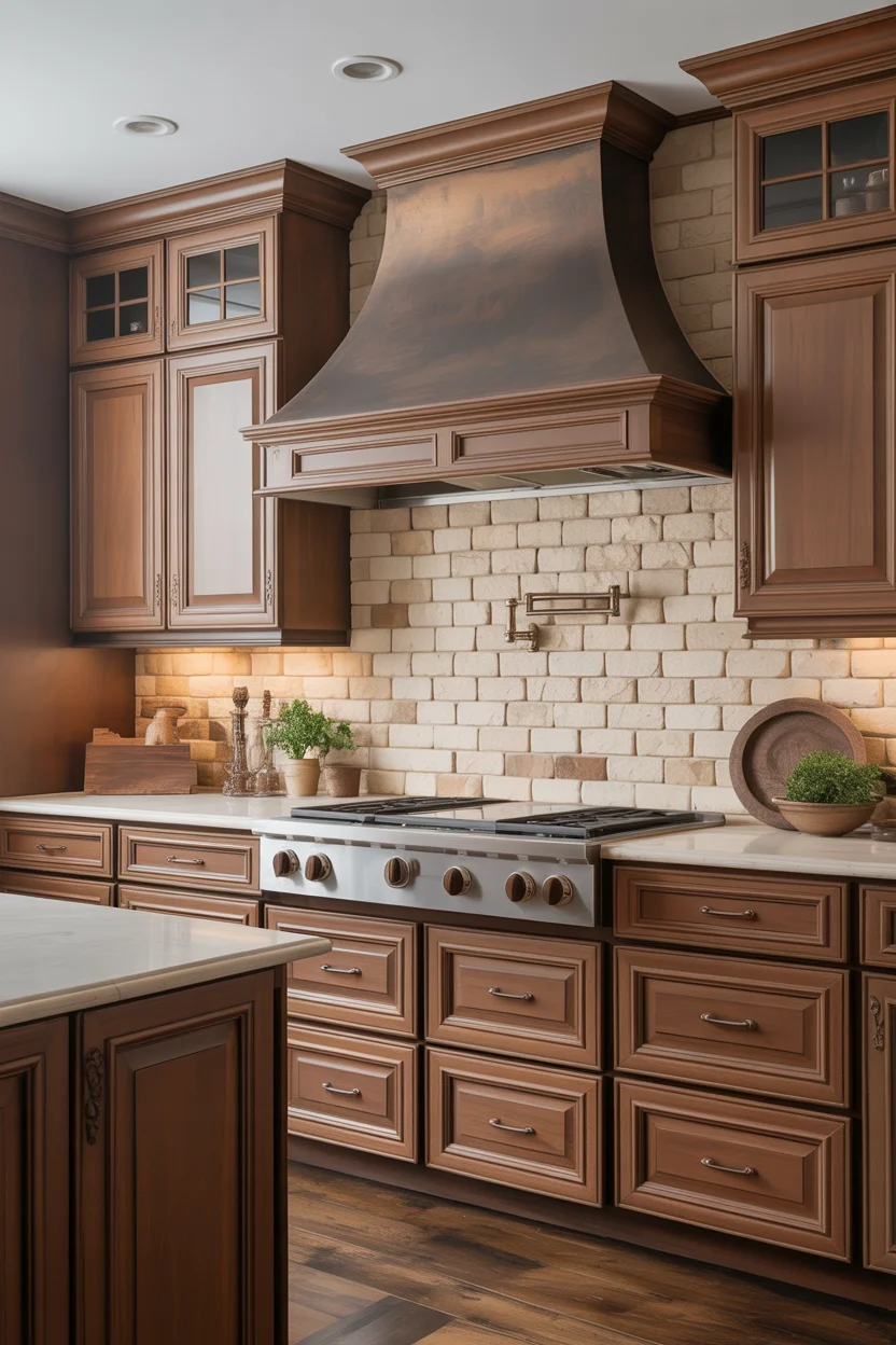
Cappuccino is the warm neutral kitchen color sitting at the most refined and sophisticated intersection of brown, beige, and warm gray — a tone referencing the specific warmth of coffee with steamed milk in a color of extraordinary sensory richness and visual depth. It carries none of the orange risk of darker terracotta-influenced browns, none of the gray coldness of sophisticated taupes, and none of the indecision of greige — instead occupying a confident, warm brown-beige position of genuine distinctiveness making kitchen cabinets painted in this color appear both luxurious and completely natural simultaneously throughout every hour of daily kitchen occupation.
The cream-toned quartz countertop and natural limestone backsplash create the material completion of this warm neutral kitchen palette with understated luxury — the cream quartz provides the brightness that deep cappuccino cabinets require to maintain the kitchen’s sense of light and spaciousness, while the natural limestone backsplash running floor to ceiling behind the range introduces the most organically warm and texturally rich material in the entire palette. Natural stone — with its inherent color variation, warm fossil inclusions, and geological depth — creates a backsplash of extraordinary beauty that manufactured tiles of any quality cannot approach. Together these three warm materials create a kitchen palette of complete, layered, deeply satisfying warmth.
19. Antique White Cabinets With Warm Wood Island
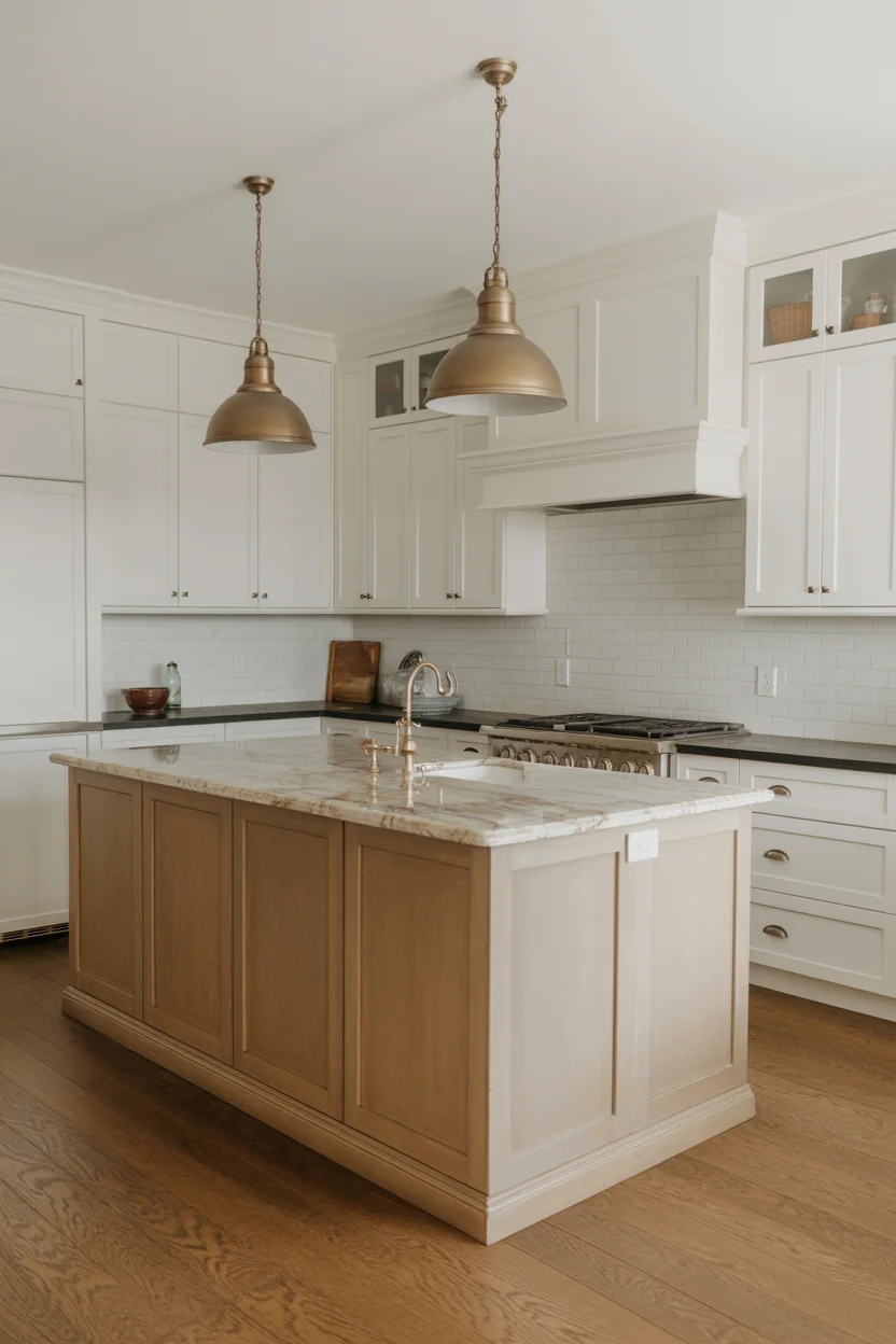
Antique white cabinets paired with a natural wood island create the warm neutral kitchen pairing of the most historically resonant and materially contrasting kind — the aged, slightly vintage quality of genuine antique white paint beside the warm, organic grain of natural honey oak creates a material dialogue between the refined painted surface and the honest natural timber that references centuries of English kitchen and farmhouse design tradition. Antique white has a depth and warmth that standard off-white lacks — it appears to have been in the room for years, developing a richness that newly painted surfaces always lack regardless of their color quality.
The specific decision to leave the island in natural wood rather than paint it to match the surrounding white cabinetry is the warm neutral kitchen design choice of the most genuine material courage and most enduring visual reward — natural wood islands in white kitchens consistently generate the warmest and most positive responses from both professional designers and everyday homeowners, because the organic grain, warm color, and tactile quality of real wood provides everything that paint, however beautifully toned, structurally cannot. Vintage-style aged bronze pendant lights complete the antique white and natural wood palette with a warm, patinated metallic note of complete period appropriateness and genuine material beauty.
20. Warm Terracotta Accented Cream Kitchen
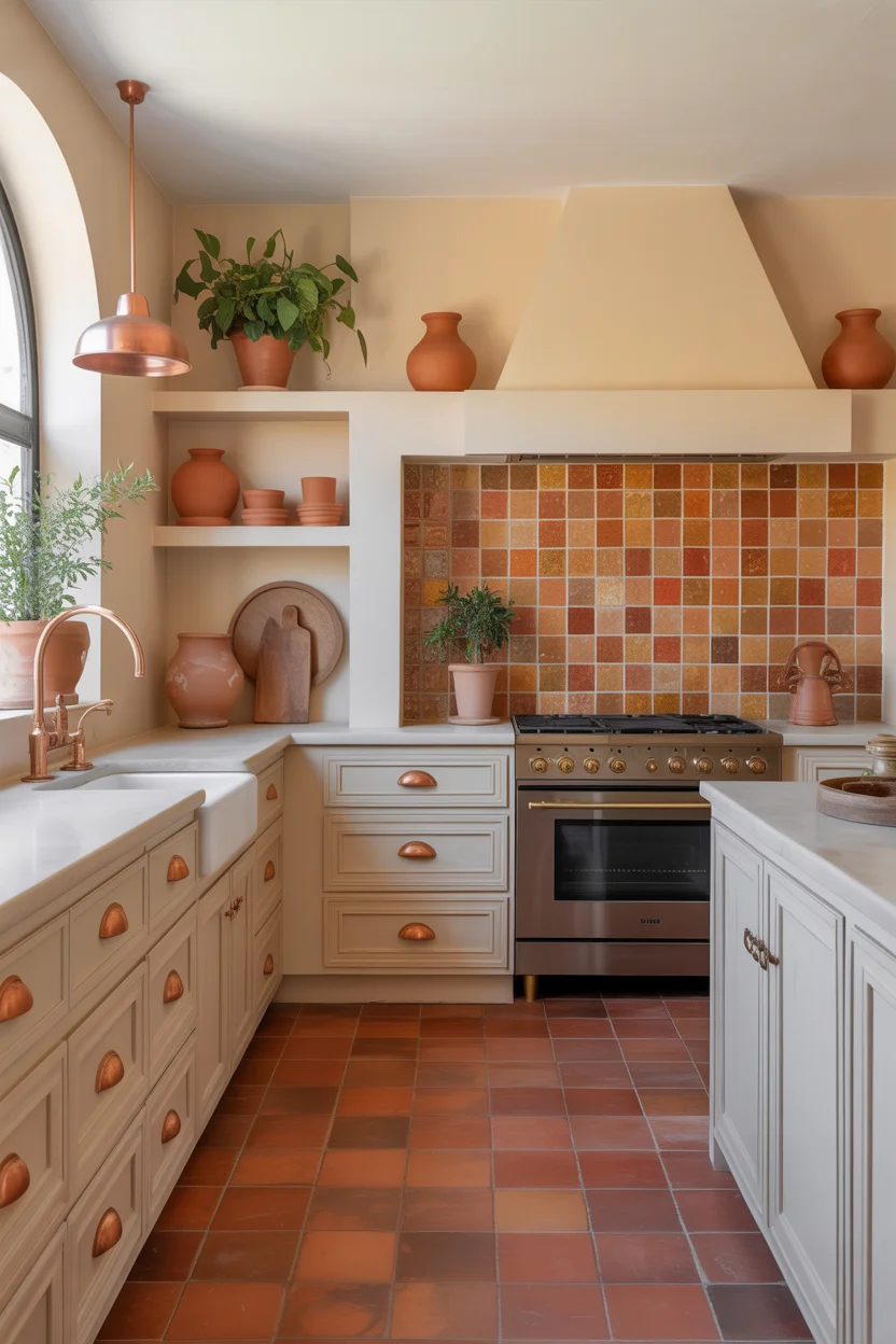
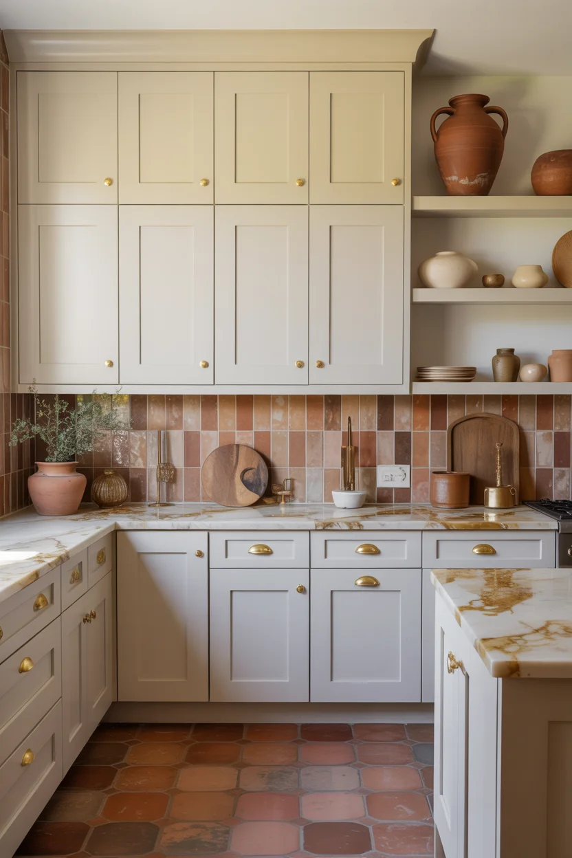
A cream kitchen with terracotta accent details woven throughout every element is the warm neutral kitchen concept of the most complete and immersive Mediterranean warmth — the cream cabinetry functions as the generous neutral canvas that allows the terracotta ceramic pulls, zellige tile backsplash, plant pots, and floor tiles to create a consistent warm earth tone accent running through every surface of the kitchen simultaneously. The terracotta-cream combination references the color palette of traditional Southern European kitchen architecture with complete authenticity, creating a kitchen feeling genuinely rooted in the warm, sun-drenched domestic traditions of Italy, Spain, and the South of France.
Terracotta zellige tiles behind the range are the single most impactful accent element in this warm neutral kitchen — each individually hand-made zellige tile has a slightly different surface, color depth, and light response from its neighbors, creating a backsplash feature of extraordinary artisanal richness and warm visual complexity that mass-produced tile cannot approach. The warm orange-red of the terracotta zellige against the cream cabinets creates a color relationship of maximum warmth and genuine Mediterranean authenticity that makes the range alcove the kitchen’s most beautiful and most immediately warmly compelling focal feature. Copper faucets catching the light and reflecting the terracotta tones complete a kitchen of complete, warm, naturally beautiful material harmony.
Conclusion
A beautifully chosen warm neutral kitchen palette does something that bold color trends simply cannot — it stays genuinely beautiful across every lighting condition, every season, and every decade of daily life. From the softest creamy white to the deepest cappuccino brown, every color on this list proves that warm neutrals offer far more variety, sophistication, and character than their understated reputation suggests. Choose the tone that genuinely makes your heart happy, build your material palette around it, and create a kitchen you will love forever.

Join The Discussion