
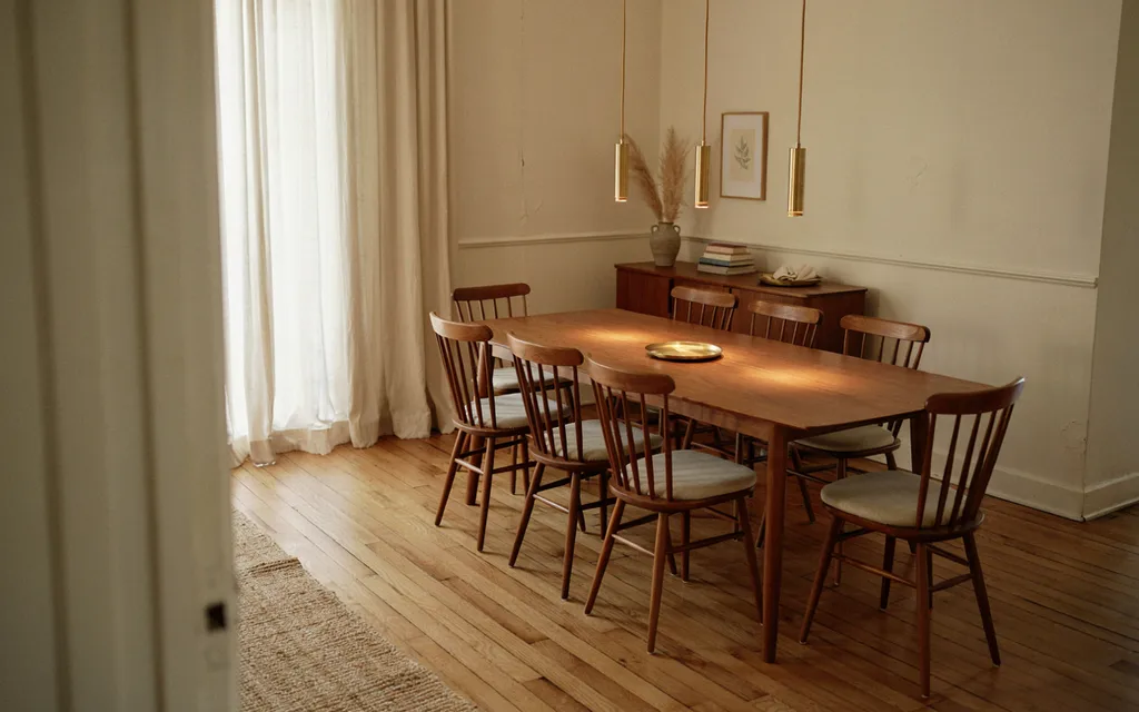
Introduction
Choosing the right neutral color palette idea can transform a home into a calm, cohesive space that feels effortlessly put together. Neutrals offer the flexibility to layer in texture, accent colors, and personal touches without ever feeling dated or overwhelming. From soft greige and cream combinations to bold black and white contrast, this list of 19 neutral color palette ideas covers a range of tones and styles to suit any room. Whether you love warm earthy hues or cool, minimalist gray, you’ll find a timeless palette to inspire your next design project here.
1. Warm Greige & Cream Palette
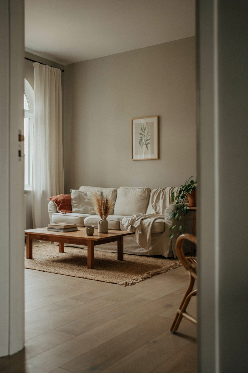
Warm greige paired with cream is one of the most versatile neutral color palette ideas for creating a soothing, cohesive foundation throughout the home. This combination blends soft gray and beige undertones, resulting in a backdrop that feels warm and inviting rather than cold or clinical, making it especially popular for living rooms and bedrooms where comfort is the top design priority.
Layering in cream textiles, light wood furniture, and natural fiber rugs reinforces the palette’s understated elegance without introducing any competing colors. Because greige and cream share similar warm undertones, they blend seamlessly across walls, upholstery, and flooring for a unified look. This neutral color palette idea works particularly well for homeowners wanting a timeless base they can easily accessorize with seasonal accent colors.
2. Black & White Contrast Palette
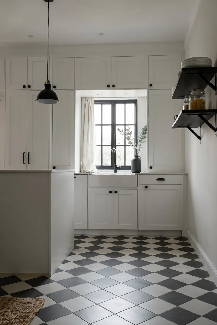
Black and white remains one of the most enduring neutral color palette ideas, delivering timeless, high-contrast style that suits both classic and contemporary interiors equally well. Pairing crisp white walls or cabinetry with black accents, whether through hardware, window frames, or flooring patterns, creates a graphic, sophisticated look that never feels dated, regardless of shifting design trends elsewhere in the home.
This palette offers exceptional flexibility, since black and white pair effortlessly with nearly any accent color introduced through artwork, textiles, or greenery. Checkerboard or herringbone tile patterns add visual texture without disrupting the monochromatic base. Designers favor this neutral color palette idea for kitchens, bathrooms, and entryways, where its bold simplicity makes a lasting impression without requiring frequent updates or redesigns.
3. Beige & Taupe Palette
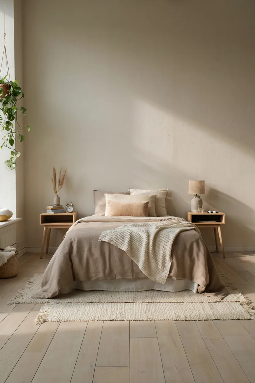
Beige and taupe together form one of the most classic neutral color palette ideas, offering a soft, understated foundation that has remained popular across decades of shifting interior design trends. This combination relies on subtle tonal variation rather than contrast, layering slightly different shades of the same warm neutral family to create depth and visual interest without introducing any bold or competing colors.
This palette works particularly well in bedrooms and living rooms, where a calm, cohesive backdrop supports relaxation and comfort. Because beige and taupe are so closely related, mixing textures like linen, wool, and light wood becomes essential for keeping the space from feeling flat or one-dimensional. This neutral color palette idea remains a dependable, timeless choice for nearly any home style or budget.
4. Soft White & Natural Wood Palette
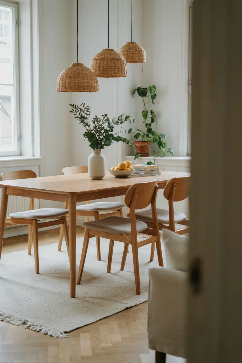
Pairing soft white with natural wood tones creates one of the most refreshing neutral color palette ideas for achieving a bright, Scandinavian-inspired look throughout the home. Unlike stark, cool white, this softer shade carries subtle warm undertones that complement the honey and amber tones found in light woods like oak, birch, and ash, resulting in a cohesive, airy atmosphere.
This palette works exceptionally well in dining rooms, kitchens, and living spaces where natural light plays a central role in the overall design. Adding woven textures, greenery, and simple ceramic accents reinforces the organic, welcoming quality of the space without introducing additional color. This neutral color palette idea is especially popular among homeowners drawn to minimalist, functional design rooted in natural materials and simplicity.
5. Charcoal & Gray Palette
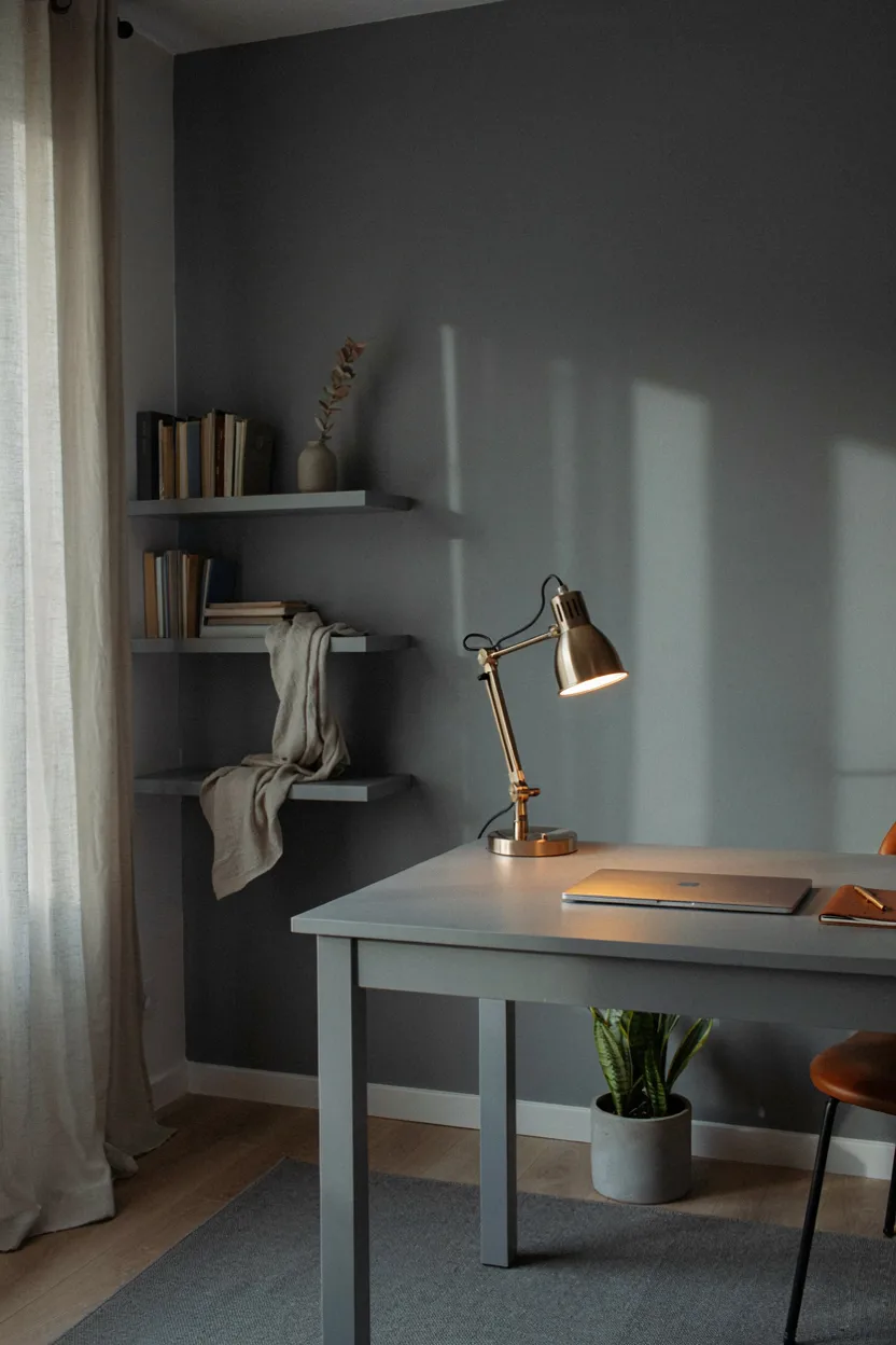
Layering charcoal and lighter gray tones together creates one of the more sophisticated neutral color palette ideas, particularly well suited to home offices, studies, and formal living spaces. This tonal approach uses varying shades within the same gray family to add depth and dimension, avoiding the flatness that can result from relying on a single neutral shade throughout an entire room.
Pairing this palette with brass or warm metal accents helps prevent the space from feeling overly cold or sterile, striking a balance between sophistication and warmth. Because charcoal and gray read as neutral, they also provide an excellent backdrop for bolder artwork or accent pieces. This neutral color palette idea suits contemporary and industrial-style interiors particularly well.
6. Ivory & Camel Palette
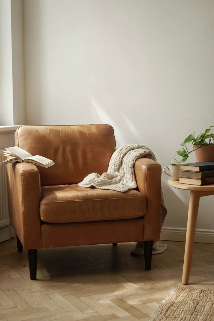
Ivory paired with camel brings a refined, timeless warmth to neutral color palette ideas, drawing inspiration from classic menswear and traditional interior design. This combination pairs a soft, creamy white base with a rich, warm tan accent color, creating a sophisticated contrast that feels elegant without being overly formal or difficult to incorporate into everyday, livable spaces throughout the home.
This palette works particularly well in reading nooks, studies, and living rooms, where leather furniture and warm wood accents reinforce the classic, collected aesthetic. Because ivory and camel share similar warm undertones, they blend seamlessly across furniture, walls, and textiles. This neutral color palette idea appeals especially to homeowners drawn to traditional, heritage-inspired design with a timeless, understated sensibility.
7. Warm White & Terracotta Accent Palette
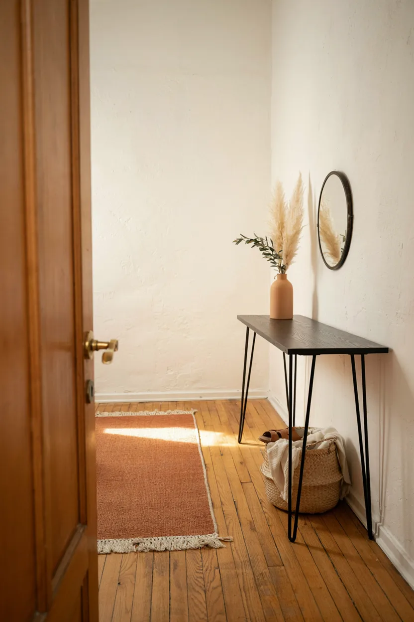
Combining warm white with terracotta accents offers one of the more dynamic neutral color palette ideas, using a soft, neutral base to let a single earthy accent color truly stand out. Rather than painting an entire room in a bold hue, this approach introduces terracotta through smaller elements like rugs, ceramics, or throw pillows, keeping the overall palette flexible and easy to update over time.
This combination works particularly well in entryways and living spaces, where warm white walls provide a clean, versatile backdrop for layering in seasonal accent pieces. Because terracotta carries warm orange and brown undertones, it complements natural wood and woven textures especially well. This neutral color palette idea offers a subtle way to introduce personality into a home without straying too far from a timeless, neutral foundation.
8. Sand & Stone Palette
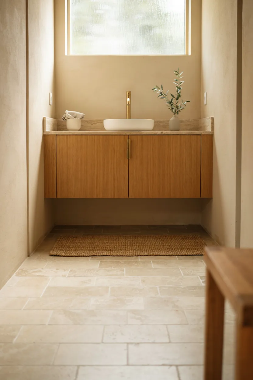
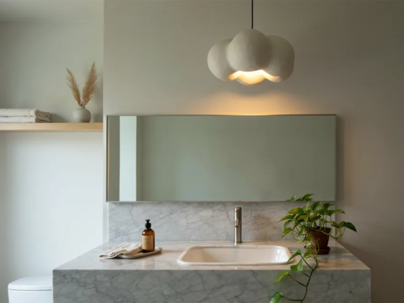
Sand and stone tones create one of the most calming neutral color palette ideas, drawing directly from natural materials for a soothing, spa-inspired atmosphere. This combination relies on soft, warm beige tones paired with the subtle texture and variation found in natural stone, resulting in a cohesive palette that feels organic and grounded rather than flat or artificially uniform throughout the space.
This palette works especially well in bathrooms and other spaces designed for relaxation, where a calm, unified color scheme supports a sense of peace and simplicity. Pairing sand-toned walls with natural stone countertops or flooring reinforces the connection to nature central to this neutral color palette idea. Adding woven textures and natural wood accents further enhances the tranquil, wellness-focused design throughout the room.
9. Mushroom & Oatmeal Palette
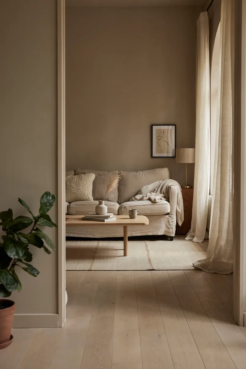
Mushroom taupe paired with oatmeal creates one of the softest, most livable neutral color palette ideas for everyday spaces like living rooms and family rooms. This combination leans into warm, brownish-gray undertones, avoiding the starkness of pure white or gray in favor of a cozier, more approachable neutral foundation that feels genuinely comfortable for daily use rather than purely decorative.
This palette pairs particularly well with linen upholstery, light wood furniture, and layered textural cushions, reinforcing a relaxed, understated aesthetic throughout the space. Because mushroom and oatmeal share such closely related warm undertones, the overall look feels cohesive and intentional without requiring careful color matching. This neutral color palette idea suits busy households looking for a durable, easy-to-maintain color scheme.
10. Cream & Walnut Brown Palette
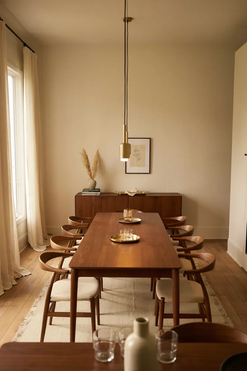
Pairing cream walls with walnut brown furniture creates one of the most classic neutral color palette ideas, relying on the natural contrast between light and dark tones within the same warm color family. This combination has remained a staple of traditional interior design for decades, offering a timeless, elegant foundation that works particularly well in dining rooms and formal living spaces.
This palette benefits from the rich grain and depth found in walnut wood, which adds visual interest and warmth against the softer cream backdrop. Brass or gold-toned fixtures further enhance the classic, sophisticated feel of the space. This neutral color palette idea appeals especially to homeowners drawn to traditional or transitional design styles rooted in quality materials and timeless proportions.
11. Dove Gray & Blush Palette
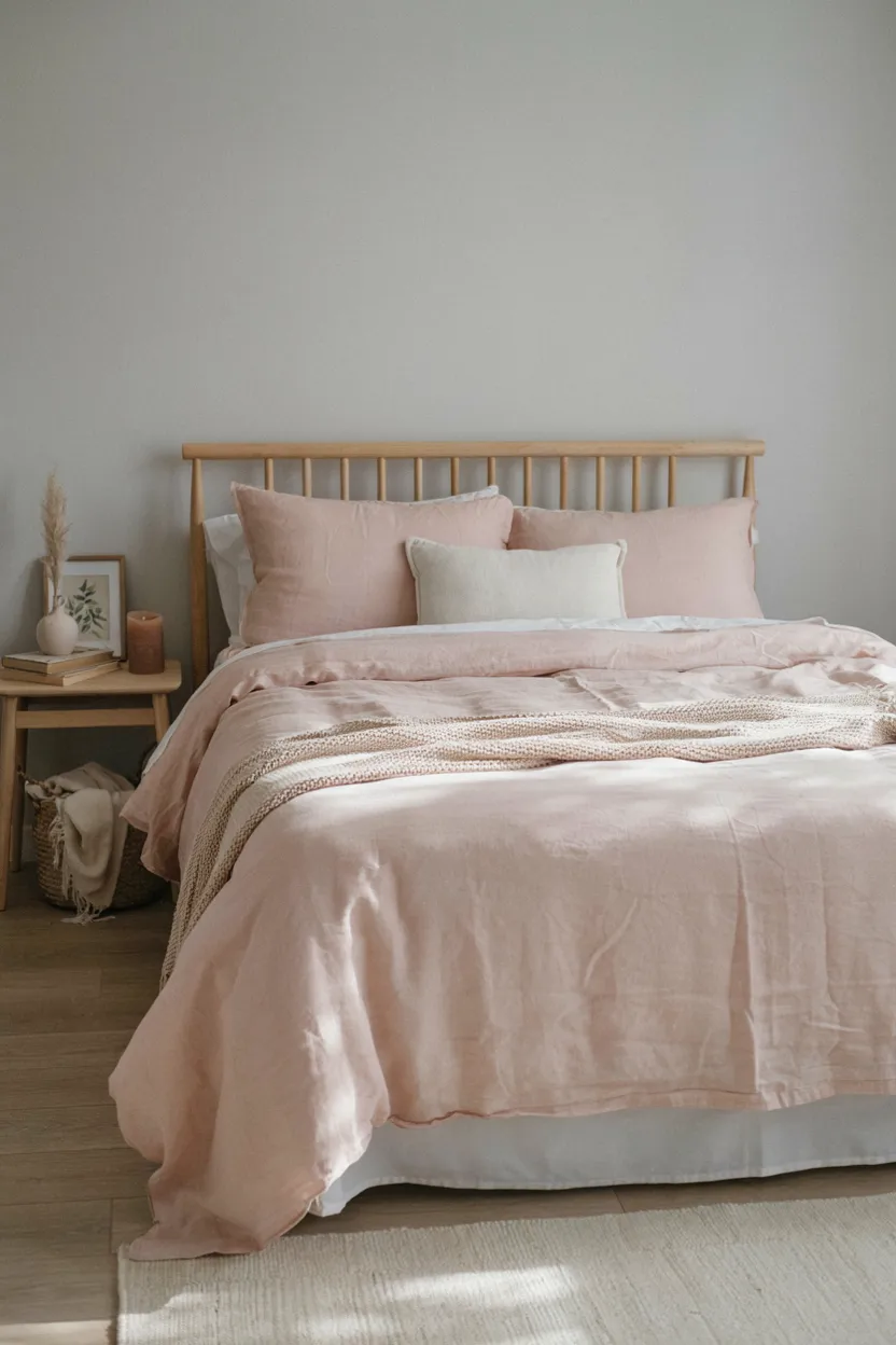
Dove gray paired with blush pink offers a gentle, romantic take on neutral color palette ideas, softening the coolness of gray with a delicate touch of warm pink. This combination works particularly well in bedrooms, where the calming gray base is balanced by the soft, understated warmth of blush accents, creating a soothing atmosphere without leaning overly feminine or saturated in color.
This palette pairs beautifully with light wood furniture and soft, natural textiles, reinforcing the overall gentle, restful mood of the space. Because both dove gray and blush carry muted, low-saturation tones, they read as genuinely neutral rather than as a bold color statement. This neutral color palette idea suits bedrooms and nurseries particularly well, offering calm sophistication with just a hint of softness.
12. Off-White & Olive Palette
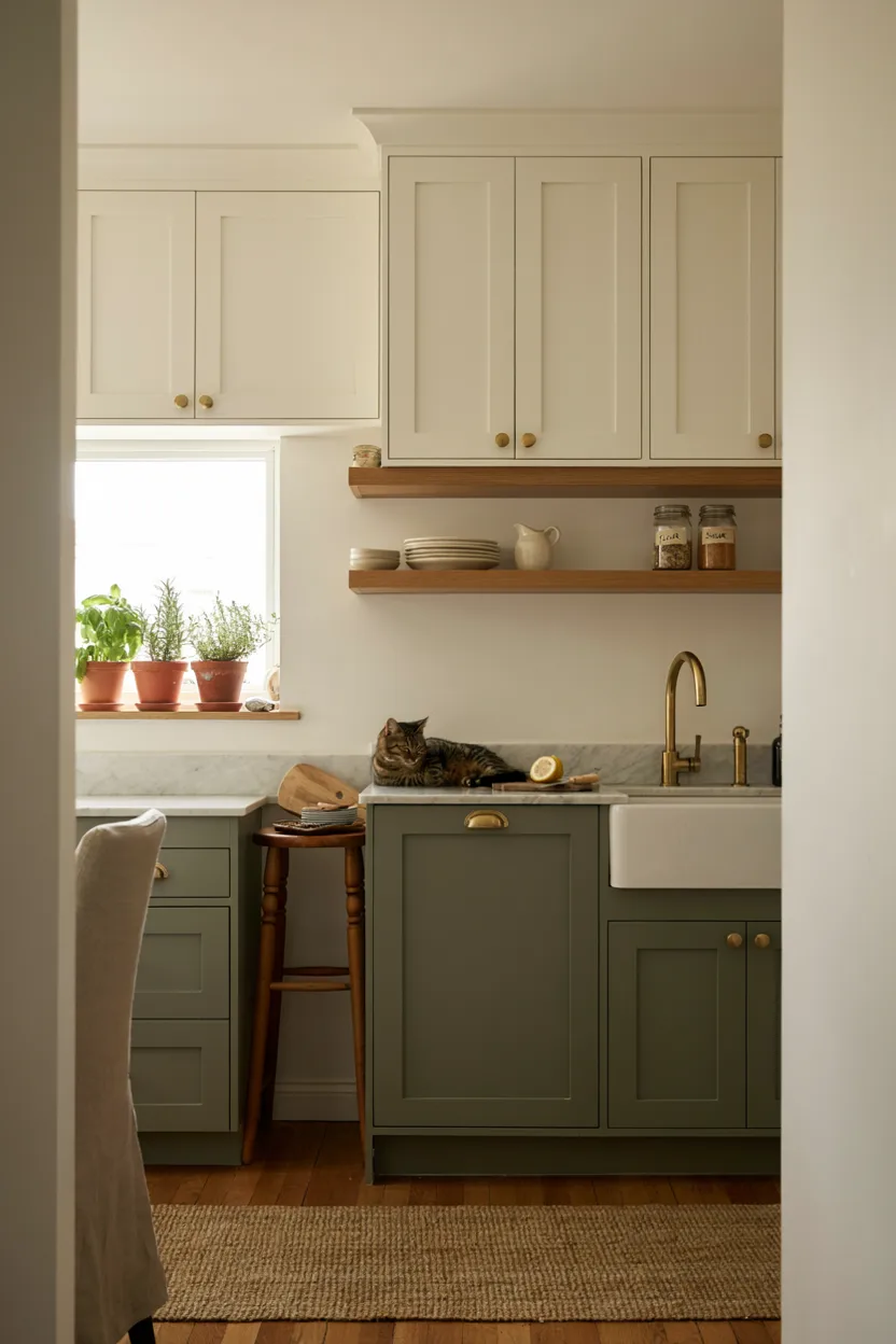
Combining off-white with olive green creates one of the more grounded neutral color palette ideas, pairing a soft, warm white base with a deep, earthy green accent for subtle contrast and visual interest. This combination has become particularly popular in kitchens, where two-toned cabinetry allows homeowners to introduce color without committing to a bolder scheme throughout the entire room.
This palette pairs beautifully with brass hardware, natural wood shelving, and greenery, reinforcing the earthy, nature-inspired quality of the olive accent. Because off-white serves as a neutral, versatile base, it balances the more saturated olive tone effectively, keeping the overall look cohesive rather than overwhelming. This neutral color palette idea suits both traditional and contemporary kitchen designs particularly well.
13. Linen & Espresso Palette
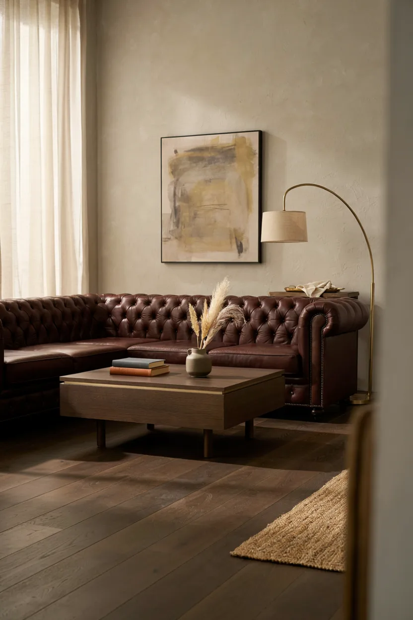
Linen paired with espresso brown delivers one of the more dramatic neutral color palette ideas, relying on strong contrast between a soft, light base and deep, rich furniture or flooring tones. This combination adds visual weight and sophistication to living rooms and studies, creating a grounded, intentional atmosphere that feels considerably more dynamic than an all-light or all-dark neutral scheme alone.
This palette benefits from the natural texture of linen textiles paired against the smooth richness of espresso wood tones, creating tactile as well as visual contrast throughout the room. Brass or warm metal fixtures further elevate the overall sophistication of the space. This neutral color palette idea works particularly well for homeowners wanting a bold, dramatic neutral scheme without introducing actual color.
14. Warm Taupe & Rust Palette
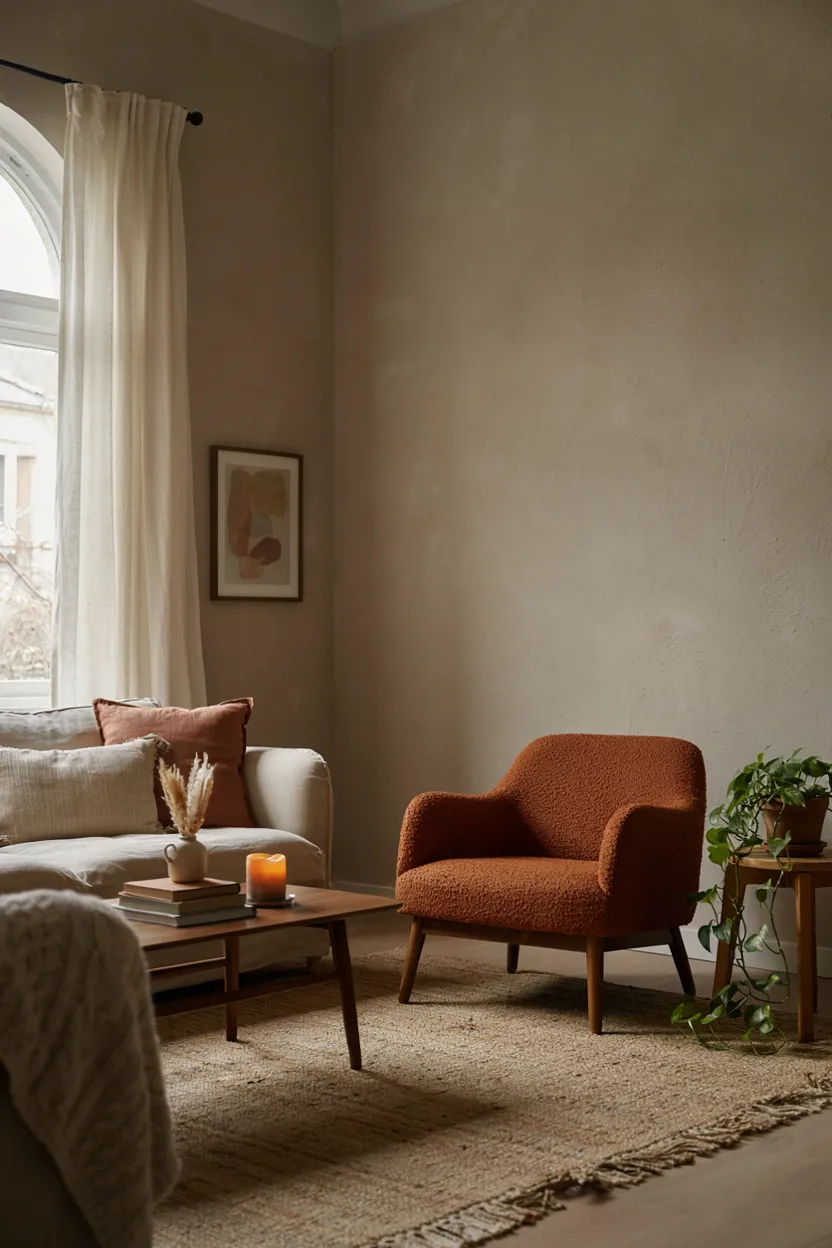
Warm taupe paired with a rust accent color creates one of the more inviting neutral color palette ideas, using a soft, neutral base to highlight a single bold, earthy accent throughout the room. This approach allows homeowners to enjoy a warm pop of color without overwhelming the space, since the surrounding taupe tones keep the overall palette grounded and easy to live with daily.
This combination works particularly well in living rooms, where a rust-colored chair or textile accent draws the eye without requiring a full-room color commitment. Because taupe and rust share similar warm undertones, the accent color feels intentional and cohesive rather than jarring. This neutral color palette idea offers an easy way to introduce personality into an otherwise calm, understated neutral foundation.
15. Alabaster & Greige Palette
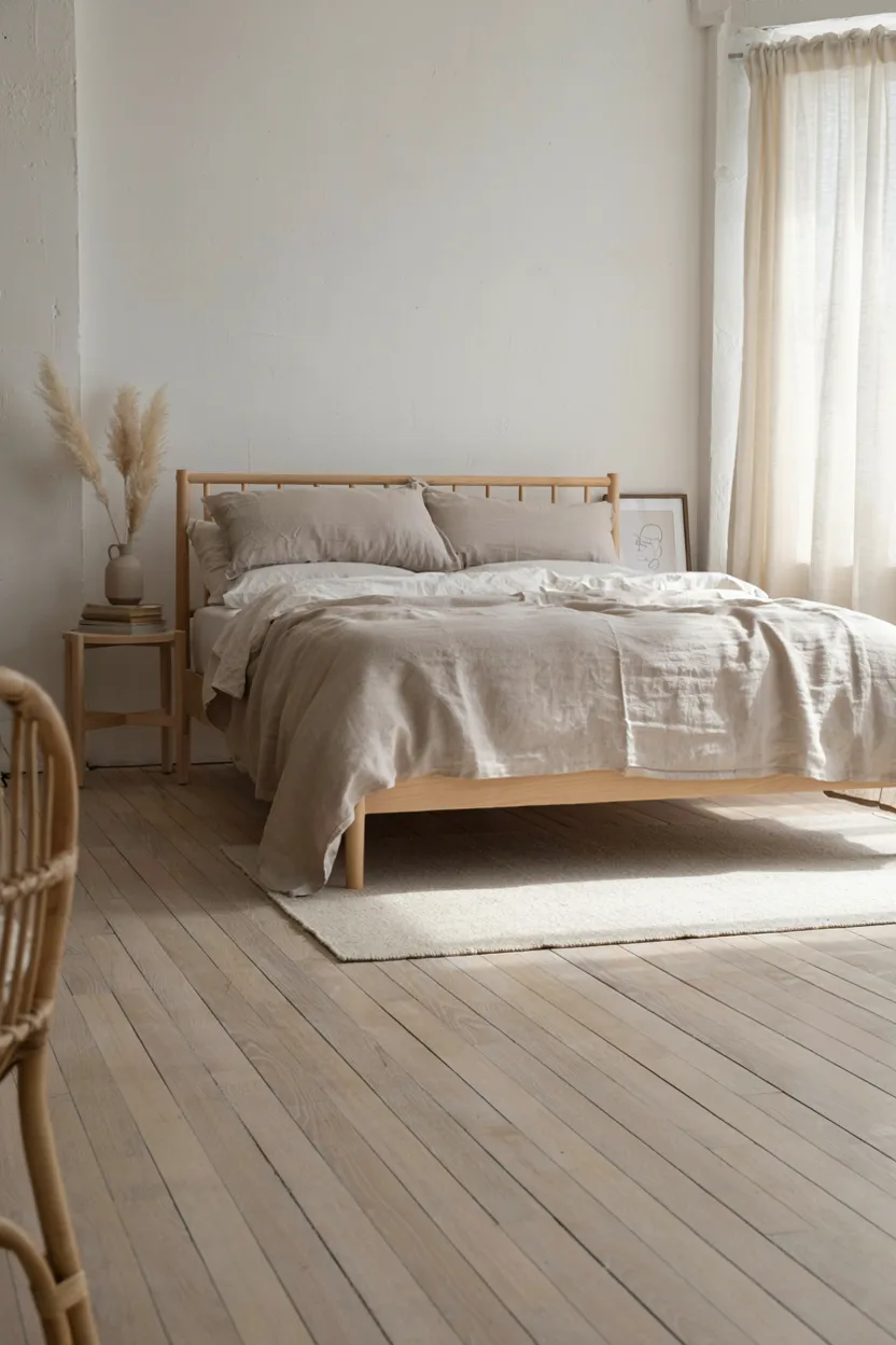
Alabaster paired with greige creates one of the softest, most subtle neutral color palette ideas, relying on gentle tonal variation rather than contrast for a calm, cohesive look. Both shades carry warm undertones, resulting in a seamless transition between wall color and furnishings that feels intentional and polished without appearing flat or one-dimensional throughout the bedroom or living space.
This palette works particularly well for homeowners who prefer an extremely understated, minimalist aesthetic, since the subtle difference between alabaster and greige adds just enough depth to keep the room from feeling monotone. Layering in natural wood and soft textiles further enhances the palette’s warmth. This neutral color palette idea suits bedrooms and nurseries especially well, supporting a calm, restful atmosphere.
16. Bone White & Charcoal Palette
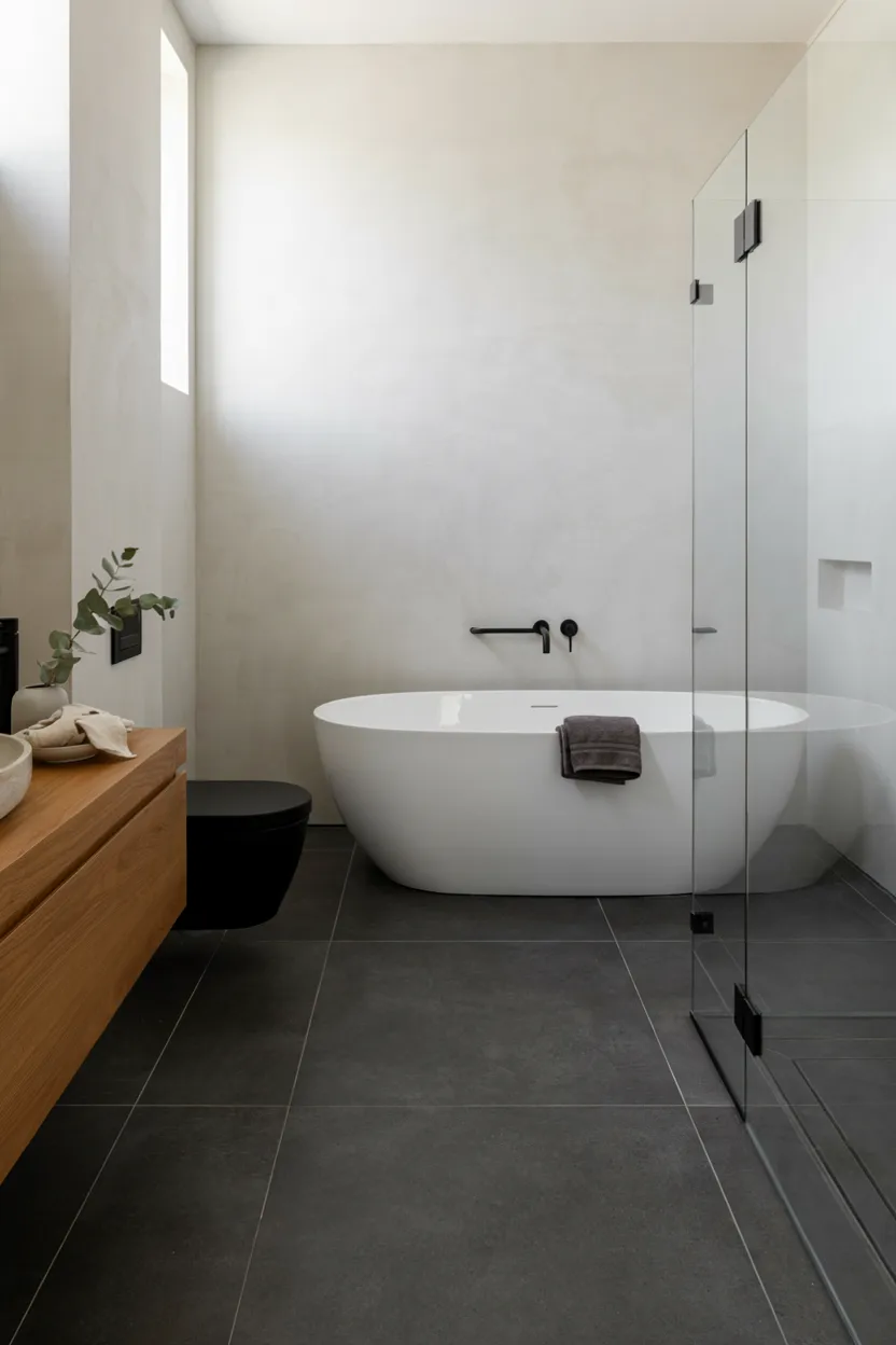
Bone white paired with charcoal gray offers a clean, contemporary take on neutral color palette ideas, using strong contrast between light walls and dark flooring or fixtures to create a modern, graphic look. This combination works particularly well in bathrooms and kitchens, where the crisp interplay between light and dark tones adds visual definition without introducing any additional color into the space.
This palette pairs beautifully with matte black fixtures, which reinforce the contemporary aesthetic while tying the charcoal and bone white tones together cohesively. Because both shades are true neutrals, this combination offers excellent flexibility for future updates, since nearly any accent color can be layered in without clashing. This neutral color palette idea suits modern and minimalist interiors particularly well.
17. Layered Neutral Textures Palette
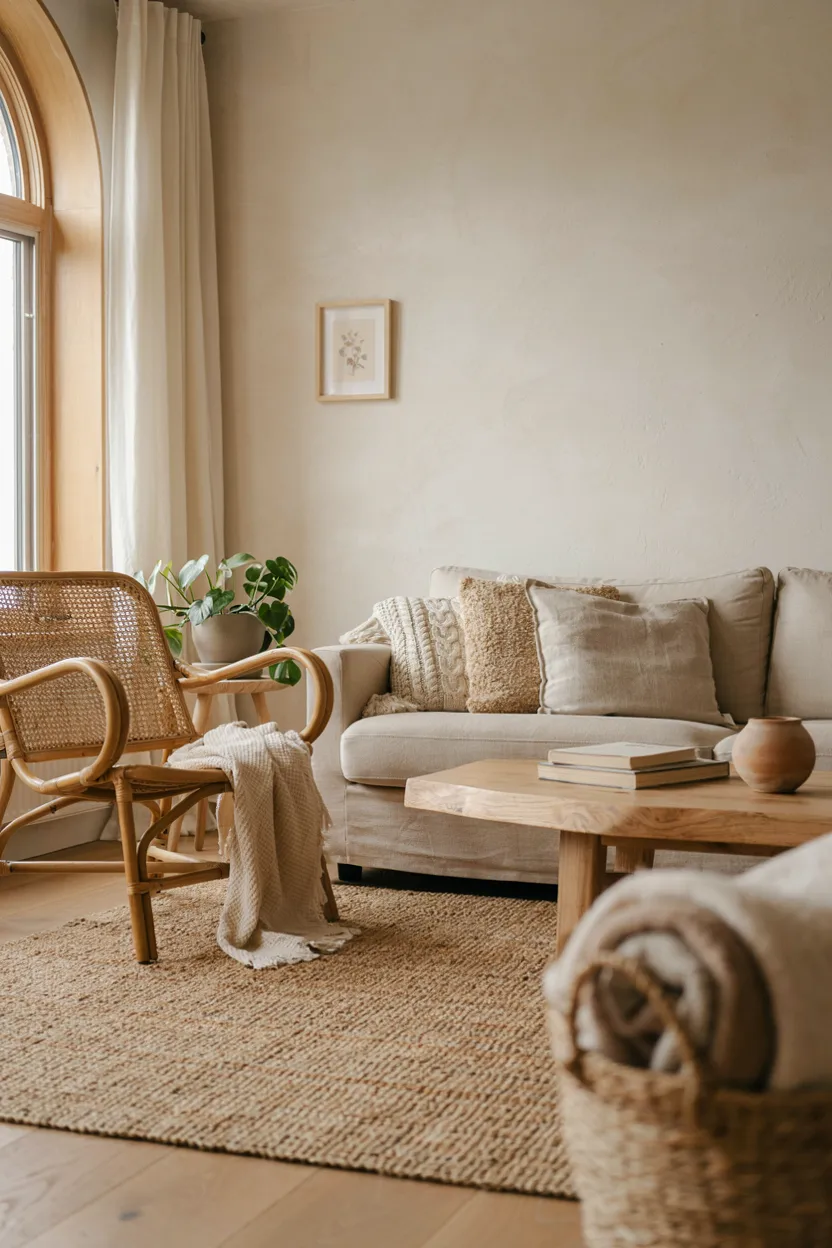
Layering textures within a single neutral color family is one of the most effective neutral color palette ideas for adding depth without introducing additional color. Combining materials like jute, linen, rattan, and light wood creates visual interest through texture rather than contrast, resulting in a rich, tactile space that still reads as calm, cohesive, and fundamentally neutral throughout the design.
This approach works particularly well in living rooms and bedrooms, where varying textures prevent an all-neutral palette from feeling flat or boring. Mixing rough and smooth surfaces, such as a nubby wool rug against a smooth leather chair, adds dimension that color alone can’t achieve. This neutral color palette idea is especially popular among minimalist and Scandinavian-inspired homes prioritizing texture over color.
18. Monochromatic Beige Palette
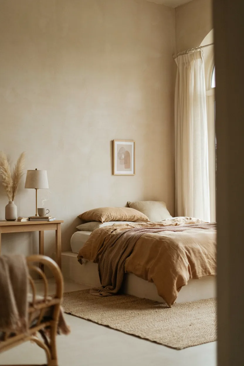
A fully monochromatic beige palette is one of the most cohesive neutral color palette ideas, layering multiple shades within the same warm color family to create a unified, calming atmosphere. Rather than introducing contrast through a different hue, this approach relies on subtle variation in tone and saturation, moving from pale sand walls to deeper camel or tan accents throughout the furnishings and textiles.
This palette works particularly well in bedrooms and living rooms designed for rest and relaxation, since the absence of contrast creates a genuinely soothing, uninterrupted visual experience. Achieving this look successfully requires careful attention to varying textures and slight tonal shifts, preventing the space from feeling flat. This neutral color palette idea rewards a thoughtful, intentional approach to layering similar tones.
19. Warm Gray & Natural Wood Palette
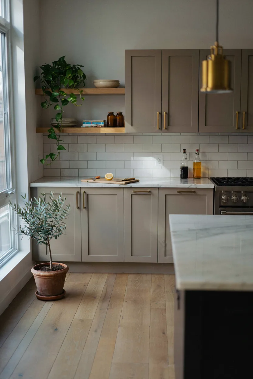
Pairing warm gray with natural wood tones creates one of the most balanced neutral color palette ideas, combining the cool sophistication of gray with the organic warmth of light wood for a genuinely contemporary look. This combination has become especially popular in kitchens, where warm gray cabinetry pairs beautifully against wood flooring, shelving, or countertops for a fresh, updated take on the classic neutral kitchen.
Because warm gray carries subtle brown undertones, it bridges the gap between cooler and warmer neutral palettes, offering exceptional flexibility for pairing with a range of accent colors. Adding brass hardware and greenery further enhances the space’s overall warmth and balance. This neutral color palette idea suits modern, transitional, and Scandinavian-inspired kitchens particularly well, offering a fresh yet timeless foundation.
Conclusion
From warm greige and cream to bold black and white contrast, these neutral color palette ideas prove that “neutral” doesn’t have to mean boring. Each combination offers a timeless foundation that adapts easily to changing trends, seasons, and personal style. Whether you’re refreshing one room or designing an entire home, pick the neutral color palette idea that feels right for your space, layer in a few personal touches, and enjoy a calm, cohesive result for years to come.

Join The Discussion