
Introduction
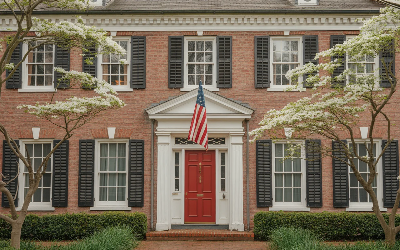
Red brick is one of the most beautiful and enduring exterior materials a home can have — but choosing the right colors to complement it feels genuinely overwhelming. The wrong shade clashes harshly. The right one makes the whole facade sing. These 23 exterior colors for homes with red brick prove that the perfect palette already exists — you just need to find yours. Every idea here is tested, beautiful, and completely worth stealing for your own home.
1. Classic Creamy White Trim With Black Shutters
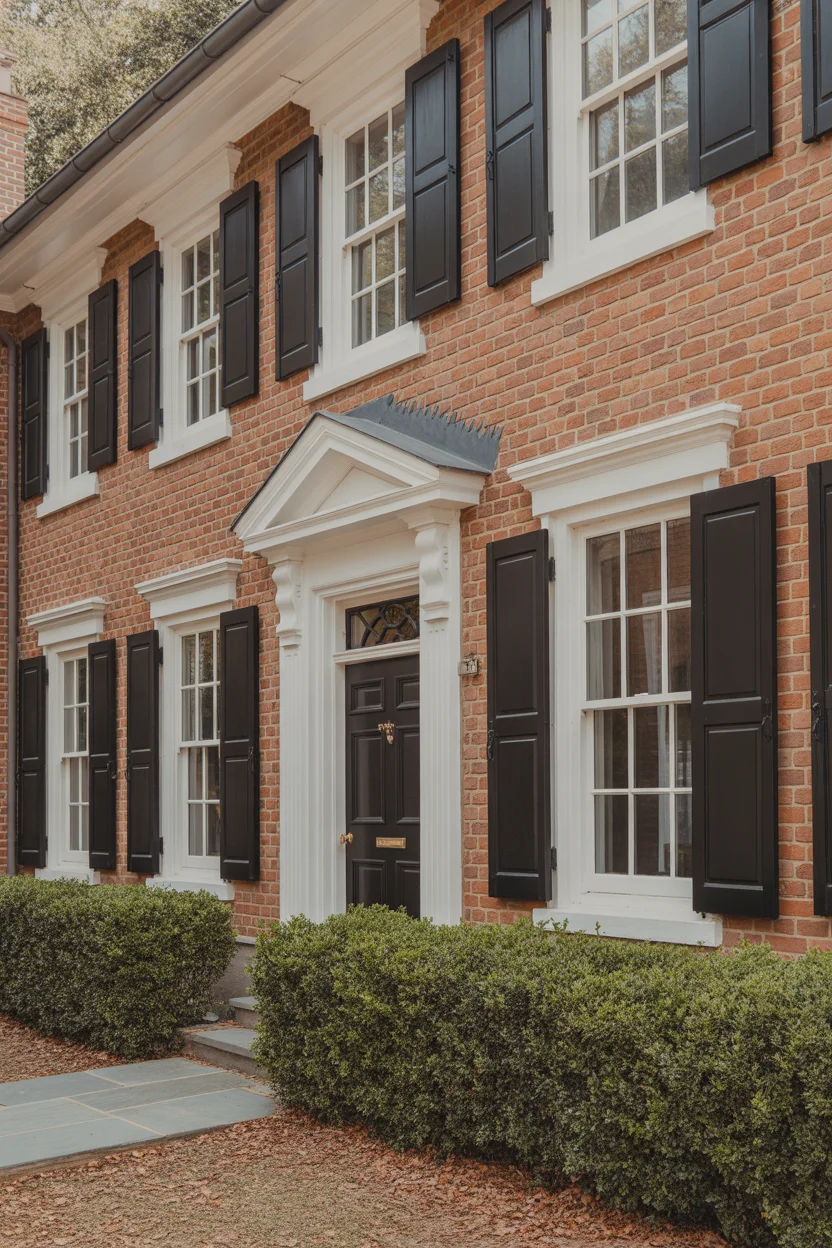
Creamy white trim against red brick is perhaps the most enduringly popular exterior colors for homes combination in American residential design — and its longevity is entirely justified by how consistently and effortlessly it works. The key distinction between creamy white and pure bright white matters enormously here: bright white can feel cold and jarring against the warm undertones of red brick, while creamy white — think Benjamin Moore “White Dove” or Sherwin-Williams “Alabaster” — harmonizes with the brick’s warmth while still providing the crisp contrast that defines the facade’s architecture beautifully.
Black shutters introduce a graphic boldness that anchors the design and prevents the white trim from feeling soft or indecisive. The combination of warm brick, creamy white, and matte black is essentially a three-tone palette with centuries of architectural precedent — it appears on Georgian manor houses, New England colonials, and classic American farmhouses with equal ease and authority. A front door painted the same matte black as the shutters creates visual continuity that makes the entry feel deliberately designed rather than assembled from separate decisions. This is the exterior colors for homes combination that never dates, never disappoints, and always impresses.
2. Soft Sage Green Trim With Warm White Accents
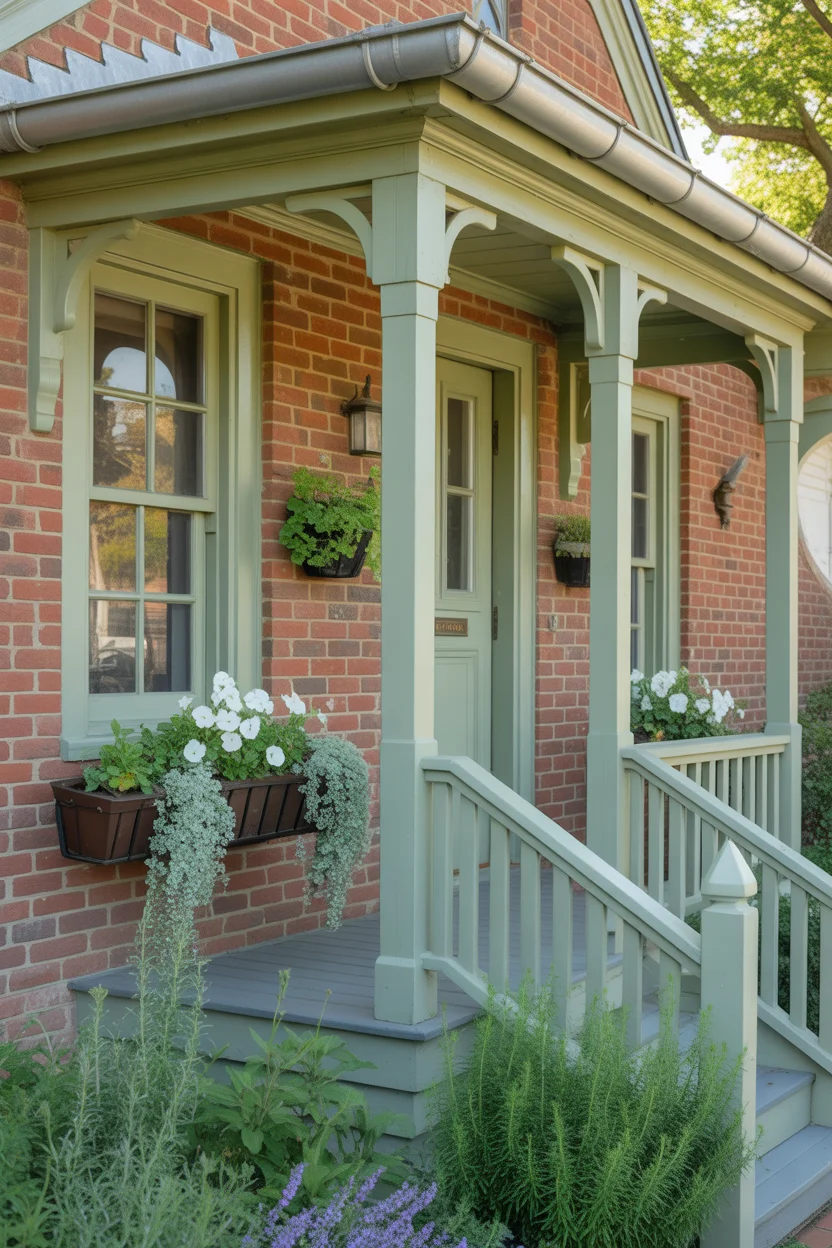
Sage green trim against red brick creates one of the most naturally harmonious exterior colors for homes pairings possible — because green and red are complementary colors on the color wheel, they intensify each other without competing, creating a visual relationship that feels simultaneously bold and completely natural. Sage specifically — with its gray undertones and muted, earthy quality — tempers that complementary energy into something sophisticated and restrained rather than festive. It reads as a color that grew from the surrounding landscape rather than one that was applied from a paint chart.
The warm white accent on porch railings and column bases performs a crucial balancing function in this palette — it prevents the sage and brick combination from becoming too visually heavy or dark, introducing brightness that lifts the overall facade without disrupting the garden-fresh color story. Window boxes planted in white and silver tones reinforce the palette’s restraint while adding the softness and organic texture that makes cottage-style homes so thoroughly appealing. For exterior colors for homes with red brick that suit cottage, craftsman, and traditional architectural styles simultaneously, sage green trim with warm white accents is an outstanding, versatile choice that rewards every season of the year.
3. Charcoal Gray Trim With Slate Blue Front Door
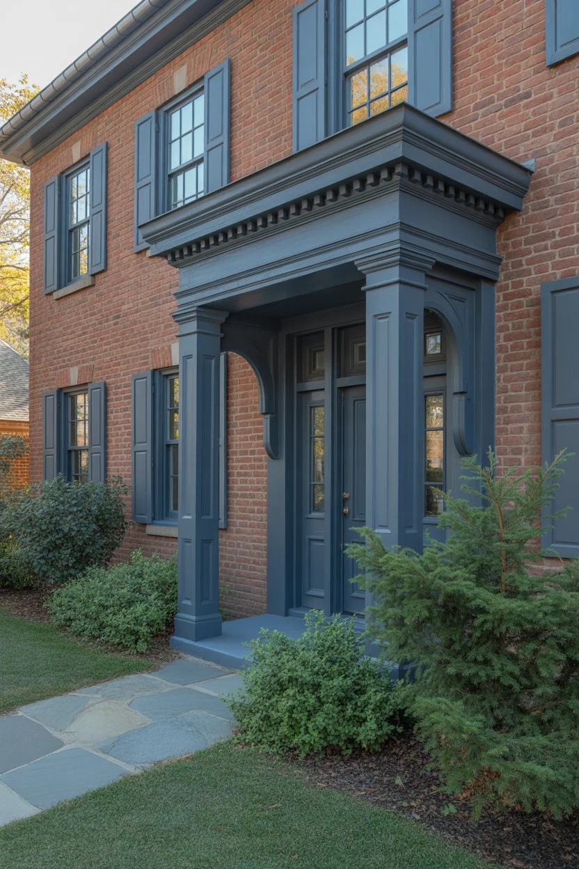
Charcoal gray trim brings an immediate sense of architectural authority to red brick homes — it grounds the warm brick in a cool, sophisticated frame that makes the entire facade appear more deliberate and considered. This exterior colors for homes combination works particularly well on brick with cooler, deeper red or burgundy undertones, where the charcoal trim reinforces that cool quality rather than fighting against a warm brick that prefers warmer companions. Charcoal on fascia boards, window surrounds, and porch columns creates a consistent shadow line around every architectural element that defines the home’s geometry with precision.
The slate blue front door is the detail that elevates this palette from simply strong to genuinely memorable. Slate blue occupies a fascinating position in the color spectrum — it reads as blue in warm light and gray in cool light, which means it harmonizes with the charcoal trim while introducing a distinct color identity that makes the entry point compelling and inviting. This combination of red brick, charcoal gray, and slate blue has a distinctly Northern European quality — reminiscent of traditional Scandinavian and British residential architecture — that suits craftsman bungalows, colonial revivals, and transitional style homes with equal elegance and lasting exterior colors for homes appeal.
4. Warm Greige Trim With Copper Lantern Accents
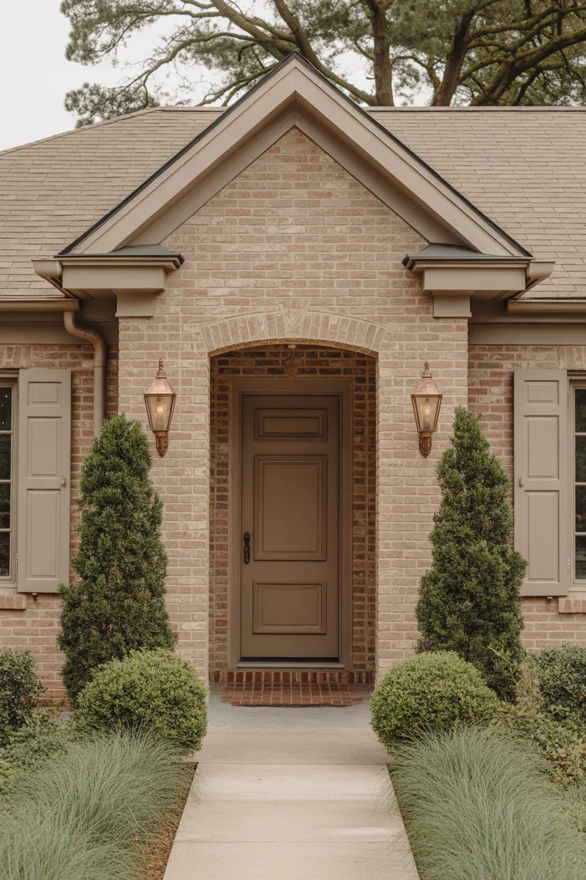
Greige — the beautifully indecisive blend of gray and beige — is the exterior colors for homes choice for homeowners who want sophistication without strong color commitment, and it works with red brick in a way that feels instinctively right. The beige component of greige echoes the warm undertones present in most red brick varieties, while the gray component introduces the cool refinement that prevents the overall palette from feeling heavy or overly warm. Together they create a trim color that genuinely flatters red brick rather than competing with it or simply disappearing into it.
Copper lantern accents introduce a metallic warmth that completes this palette with genuine elegance. Aged copper develops a beautiful verdigris patina over time that introduces soft green tones into the palette — green being red brick’s natural complementary color — creating a color relationship that becomes more beautiful as the copper ages rather than less. Position matching copper lanterns on each side of the front door and allow them to weather naturally for a result that looks authentically established and curated over time. This exterior colors for homes approach is understated, warm, and thoroughly impressive in its quiet confidence.
5. Deep Navy Blue Trim With Crisp White Accents
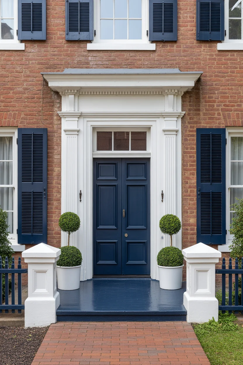
Deep navy blue and red brick is a exterior colors for homes combination with genuine historical authority — it appears on Federal-style homes, colonial estates, and New England seaside architecture throughout the northeastern United States, and its enduring presence in those architectural traditions reflects how extraordinarily well it works. The depth and richness of navy blue creates a contrast against warm red brick that is bold without being jarring — the blue is dark enough to read as a grounding, stabilizing element rather than a competing color that fights for dominance against the brick’s strong warm presence.
The crisp white accents on window surrounds, porch railings, and column bases introduce the brightness that prevents the navy and brick combination from becoming too heavy or visually dense. White acts as a visual breath between the two dominant tones, creating definition and clarity that makes every architectural element legible from the street. The three-tone combination of red brick, deep navy, and crisp white is essentially the palette of American confidence — it communicates quality, pride of ownership, and an understanding of architectural tradition that makes this exterior colors for homes choice perpetually impressive and thoroughly appropriate for traditional residential design.
6. Forest Green Trim With Natural Wood Door
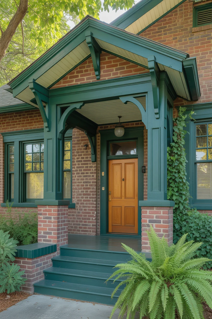
Forest green trim against red brick is one of nature’s own color combinations — green foliage against red brick is something we see in every established garden where ivy, climbing hydrangea, or Boston ivy clings to old masonry, and the reason it looks so beautiful is precisely because nature has been pairing these colors together for centuries. Deep forest green trim brings that same organic rightness to painted architectural elements, creating an exterior colors for homes palette that feels simultaneously bold and completely inevitable — a color choice that looks as though the home couldn’t possibly be any other color.
The natural wood front door introduces a third tone that completes the palette with warmth and organic authenticity. A medium-toned oak or teak door with a clear exterior varnish celebrates the natural grain of the wood rather than hiding it under paint, creating a material richness at the entry point that painted doors can rarely match. The visual warmth of natural wood sits beautifully between the cool depth of forest green trim and the warm red of the brick, acting as a bridge material that unifies the palette’s different temperature registers. This exterior colors for homes combination suits craftsman, arts and crafts, and traditional cottage architectural styles with outstanding natural ease.
7. Warm Terracotta Trim With Cream Accents
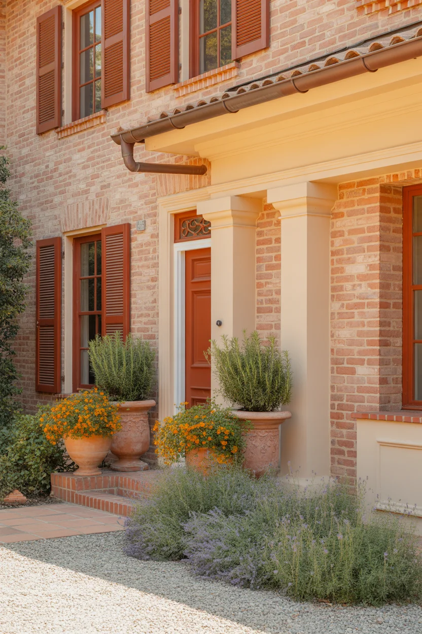
Terracotta trim against red brick is a daring exterior colors for homes choice that works because it embraces rather than contrasts the brick’s inherent warmth — it amplifies the orange and sienna undertones already present in the masonry, creating a total palette of sun-soaked warmth that is thoroughly joyful and unmistakably Mediterranean in character. This approach requires confidence because there is no strong contrast to provide visual relief — instead, the design relies on subtle tonal variation between the brick and trim, and the texture difference between the masonry and the painted wood surfaces, to create visual interest and definition.
Cream accents on window surrounds and porch columns provide the light relief that prevents this warm palette from feeling overwhelming. The cream is warm enough to belong within the terracotta and brick color family while being light enough to introduce brightness that lifts the facade and keeps it feeling fresh rather than heavy. This exterior colors for homes combination suits Spanish colonial, Italianate, and Mediterranean revival architectural styles with extraordinary authenticity, and it pairs beautifully with gravel driveways, terracotta pot plantings, lavender borders, and the kind of generous, sun-loving planting that makes a home feel like a private Mediterranean escape every time you pull into the driveway.
8. Slate Gray Trim With Burgundy Front Door
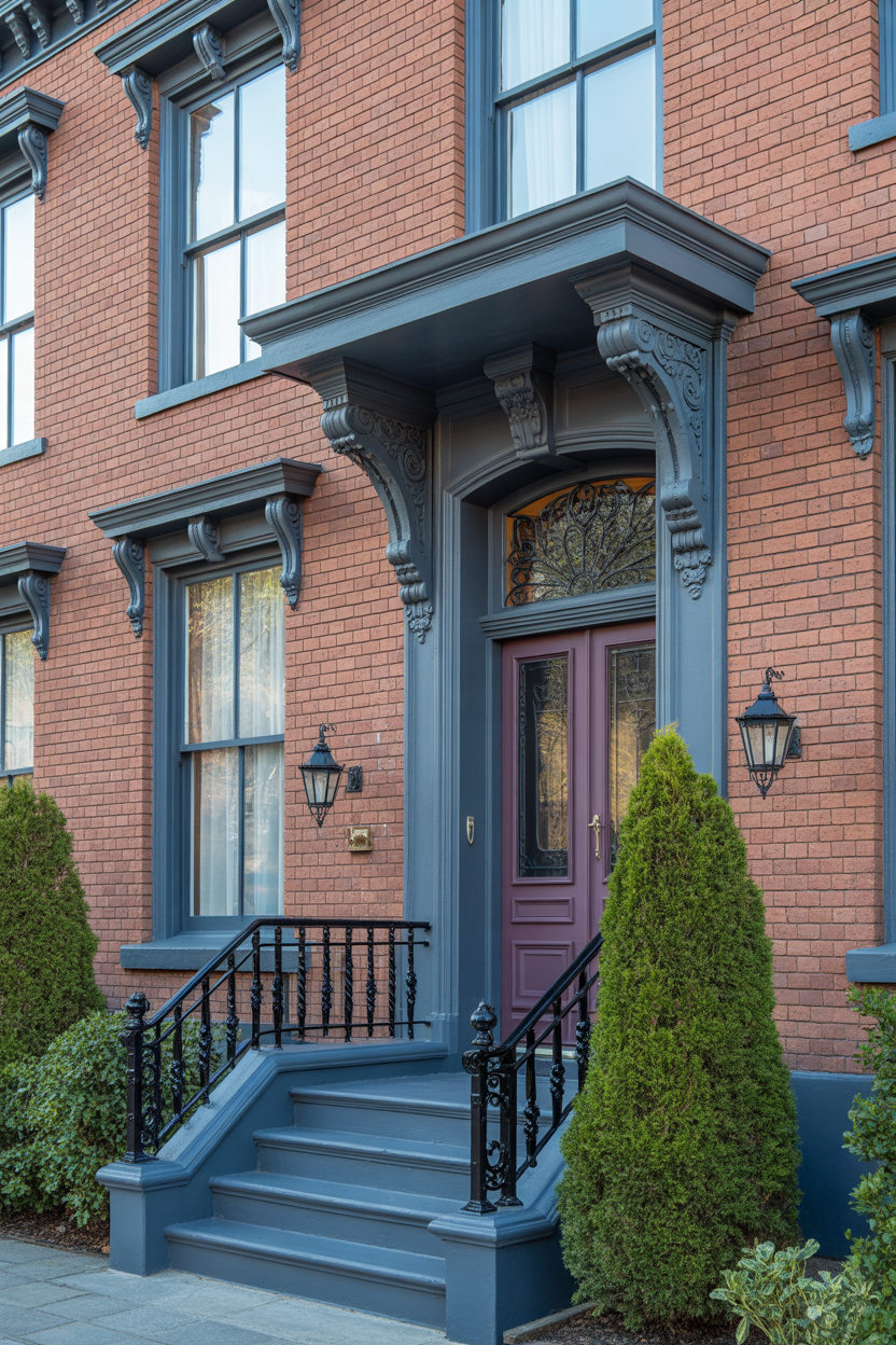
Image Description: A sophisticated red brick Victorian-style home with slate gray painted trim on elaborate window surrounds, decorative bargeboard, porch brackets, and fascia boards. The front door is painted a rich burgundy — darker and more purple-toned than the brick itself — creating a dramatic, jewel-toned entry focal point. Black iron porch railings, period-appropriate gas-style lanterns, and clipped yew hedging in symmetrical placement complete the refined, historically grounded exterior palette.
Slate gray trim brings a cool, refined quality to red brick Victorian homes that allows the elaborate architectural details of this style — decorative bargeboards, ornate window surrounds, turned porch columns, and decorative brackets — to read clearly and beautifully against the warm masonry background. Gray’s neutrality means it neither competes with the brick nor disappears into it, instead providing a consistent tonal frame that defines every architectural element with quiet precision. For exterior colors for homes where the architecture itself is ornate and the goal is to let that detail be fully appreciated, slate gray is an outstanding choice.
The burgundy front door introduces the palette’s most dramatic and memorable element — a rich, deep jewel tone that references the brick’s own red family while taking it in a darker, more formal direction. Burgundy at the entry creates a focal point of genuine depth and sophistication that draws the eye immediately and signals that every design decision on this exterior has been carefully considered. The relationship between the warm red brick, cool slate gray trim, and deep burgundy door creates a three-tone exterior colors for homes palette of remarkable complexity and beauty — one that rewards careful viewing and improves with every passing season as the surrounding planting matures.
9. Pure White Trim With Bold Red Front Door
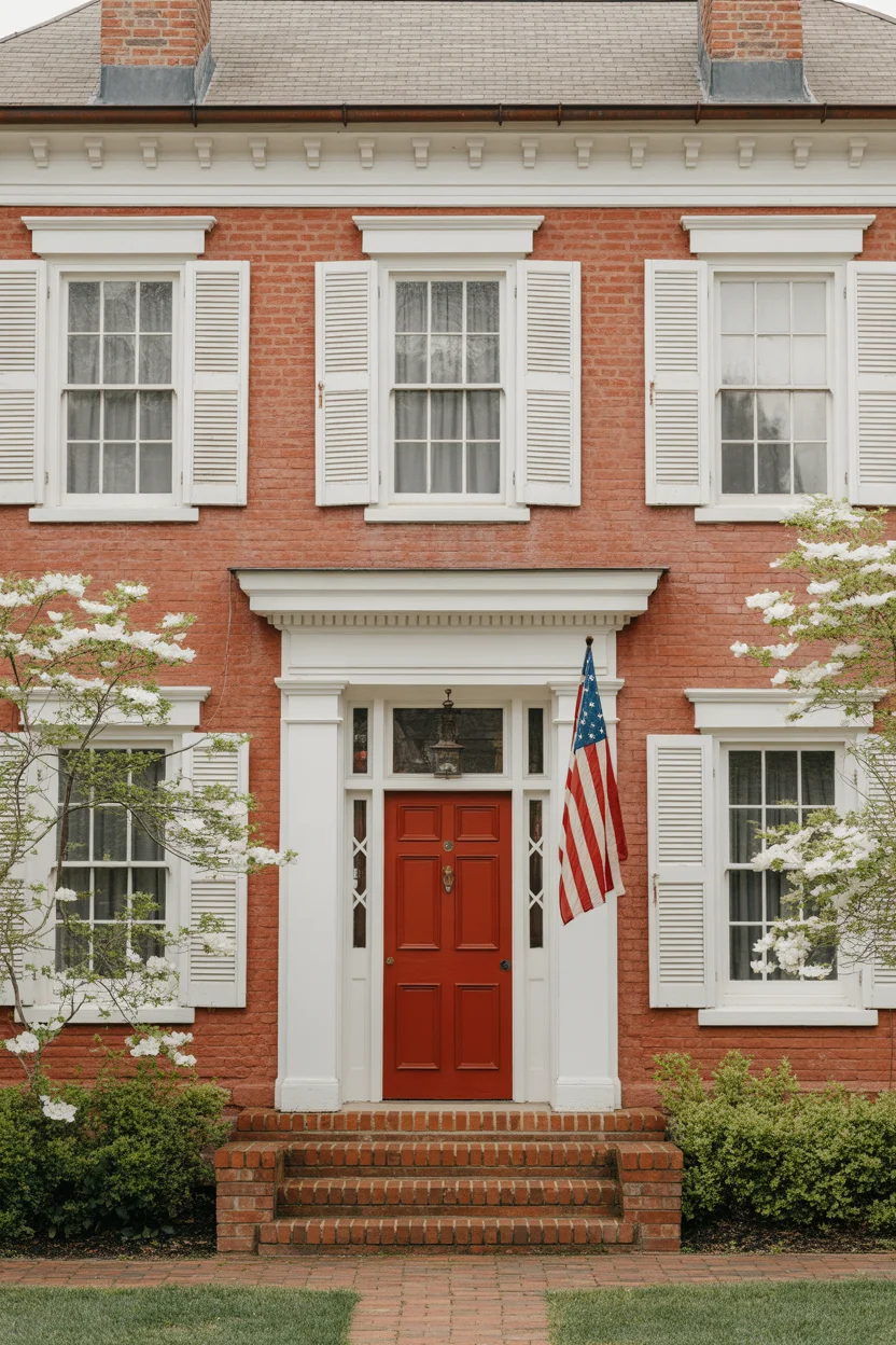
Pure white trim on a red brick colonial is the most essentially American exterior colors for homes combination imaginable — it has graced the facades of traditional homes from New England to Virginia since the early republic, appearing on everything from modest farmhouses to grand plantation estates with equal ease and appropriateness. The key to making pure white work against red brick — rather than the softer creamy whites discussed elsewhere — is the brick’s undertone: warm orange-red bricks can handle the brightness of pure white without feeling cold, while cooler burgundy-toned bricks prefer the warmth of a cream or off-white companion.
A bold red front door against white trim and red brick creates a palette of extraordinary graphic confidence — the door color echoes the brick’s own red family, creating a tonal harmony that feels intentional rather than accidentally matched. Choose a front door red that is slightly more saturated and slightly deeper than the brick’s natural color — a lacquered, high-gloss finish on the door amplifies its visual impact dramatically. The high-gloss sheen against matte brick and flat-painted white trim creates a material contrast that is as satisfying as the color relationship. This exterior colors for homes choice is unambiguously American, consistently beautiful, and perfectly appropriate for colonial, federal, and traditional residential architecture throughout the country.
10. Taupe Trim With Olive Green Shutters
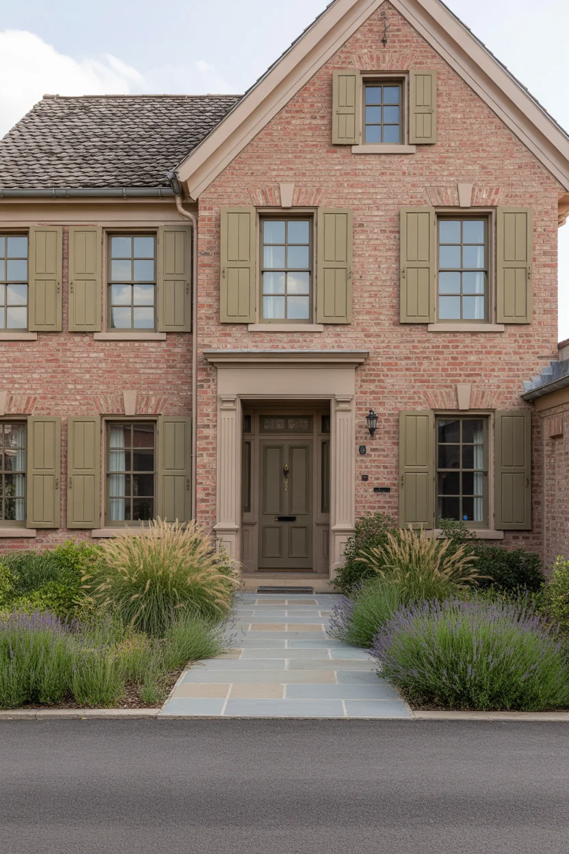
Taupe trim with olive green shutters creates an exterior colors for homes palette with a distinctly English country house quality — warm, grounded, slightly understated, and deeply elegant in the way that only combinations rooted in the natural world can be. Taupe’s warm gray-brown tone echoes the mortar lines between bricks and the natural weathered stone elements that often accompany red brick architecture, creating a trim color that feels indigenous to masonry construction rather than applied to it. It grounds the facade without darkening it, providing a steady visual anchor for the entire exterior color scheme.
Olive green shutters introduce the palette’s most interesting color relationship — the subtle green of olive interacts with the red of the brick as complementary colors, creating a visual vibrancy between the two elements that makes both appear more saturated and more beautiful than either achieves alone. The muted, earthy quality of olive green keeps this complementary relationship sophisticated rather than festive — it’s a green that has clearly been in the garden for decades rather than just applied from a paint chart. Repeat the olive on the front door for visual continuity and the whole exterior colors for homes palette reads as a single, beautifully coordinated design decision.
11. Dark Espresso Brown Trim With Brass Hardware Accents
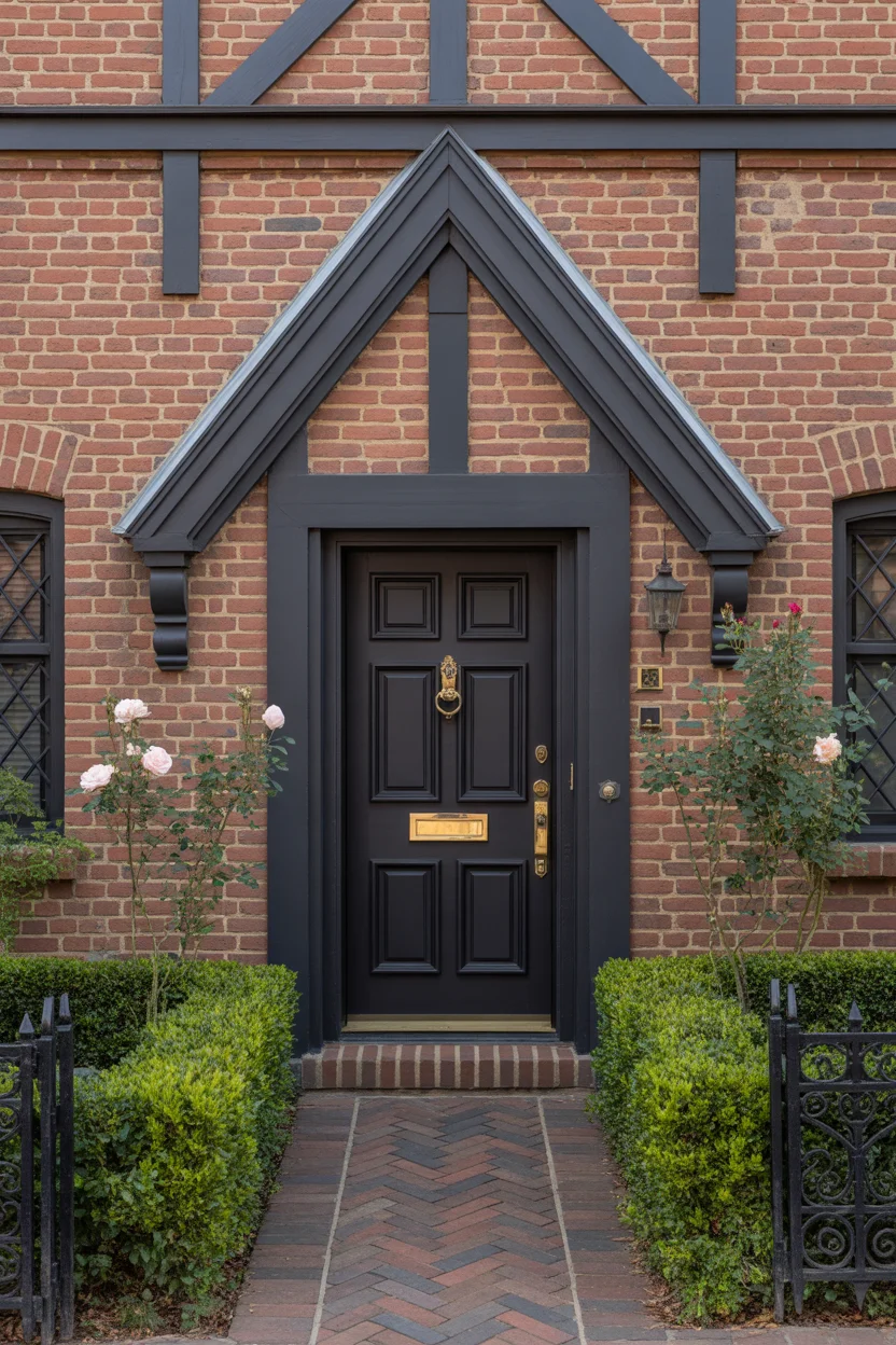
Deep espresso brown trim against red brick creates one of the most dramatic and architecturally serious exterior colors for homes pairings on this list — a combination that makes red brick appear richer, deeper, and more substantial than any lighter trim color could achieve. The dark trim provides maximum contrast with the brick’s warmth, defining every architectural element with absolute precision and giving the entire facade a sense of weight and permanence that is extraordinarily compelling. On Tudor-style homes where dark half-timbering is an authentic architectural feature, espresso brown is not just appropriate — it’s historically correct.
Polished brass hardware accents introduce warmth and luminosity that prevents the dark trim from creating a facade that feels heavy or somber. The golden tones of brass sit beautifully within the red, brown, and warm palette of the brick and trim, creating points of warm metallic highlight that catch light throughout the day. A knocker, mail slot, house numbers, and door handle all in matching polished brass creates a level of coordinated detail that signals genuine design care and attention. This exterior colors for homes combination is particularly effective on Tudor, Jacobean, and traditional English-inspired residential architecture where the dark trim has authentic historical and architectural meaning.
12. Soft Blue-Gray Trim With White Porch Details
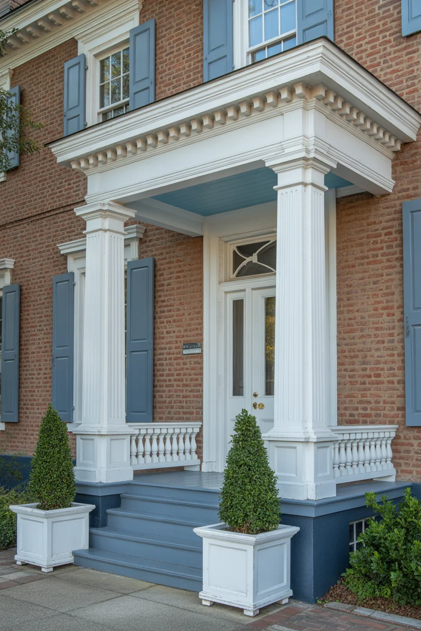
Soft blue-gray trim against red brick creates the most classically Southern and Greek Revival of all exterior colors for homes pairings — a combination with deep roots in antebellum architecture throughout Georgia, the Carolinas, and Virginia, where grand red brick plantation homes frequently featured blue-gray or blue-green painted portico elements that referenced the classical Greek and Roman architectural traditions that inspired the style. The soft blue-gray tone sits beautifully against warm red brick, providing cool contrast without the graphic boldness of navy or the cool austerity of pure gray.
The white porch ceiling in the traditional “haint blue” variation — a blue-green tone historically believed to ward off evil spirits and practically chosen because it deters wasps and other insects from nesting in porch ceilings — adds a layer of architectural and cultural authenticity to this palette that is genuinely beautiful and historically meaningful. Against the blue-gray column shafts and the warm red brick behind, the blue-white ceiling creates a layered color story with real architectural depth. For exterior colors for homes with Greek Revival, Federal, or Southern Colonial architecture, this is the palette that honors the tradition while remaining thoroughly beautiful by contemporary standards.
13. Warm Ivory Trim With Sage Green Shutters and Door
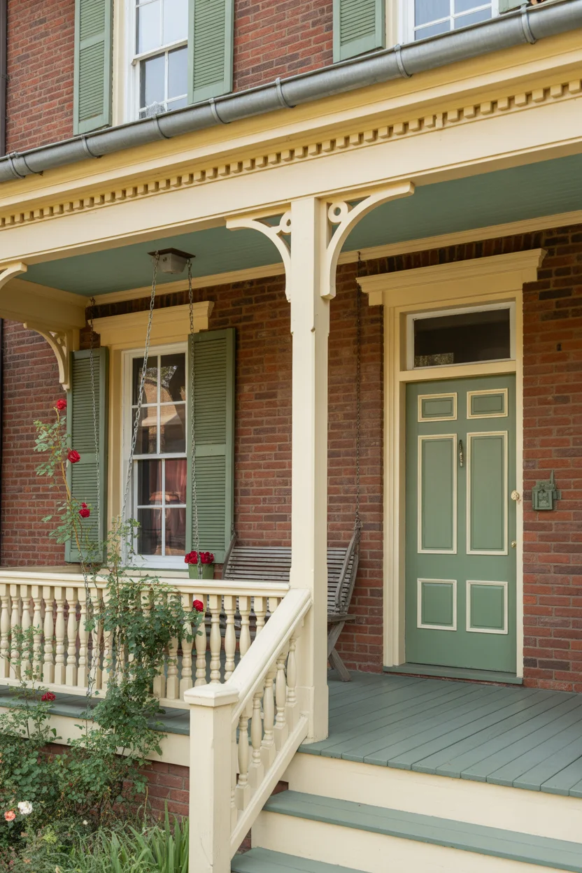
Warm ivory trim creates a gentler, more approachable version of the classic white trim look — it shares the same fundamental function of defining architectural elements against the brick, but does so with a warmth and softness that suits more relaxed, cottage-influenced, and garden-oriented homes more naturally than brilliant white. Ivory is particularly flattering against red bricks with warm orange or terra-cotta undertones, picking up those warmth signals and reflecting them back in a way that makes the whole facade feel sun-kissed and welcoming. As an exterior colors for homes choice it is versatile, timeless, and universally flattering.
Sage green shutters and door in combination with warm ivory trim and red brick create a palette that feels genuinely garden-grown — the three tones of warm red, soft ivory, and muted green exist in nature wherever flowering plants grow against old masonry, and that natural precedent makes the combination feel instinctively right. The climbing roses scrambling up the porch post complete the garden narrative beautifully, adding fragrance and seasonal flower color that makes this exterior genuinely beautiful rather than merely well-painted. For exterior colors for homes that aim for warmth, charm, and a sense of deeply established domestic comfort, this combination delivers everything required.
14. Midnight Black Trim With Gold Hardware
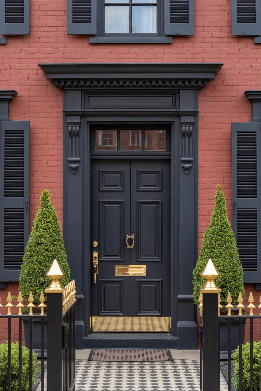
Midnight black trim on a red brick home makes the boldest exterior colors for homes statement on this list — and it is a statement of extraordinary design confidence that, when executed with precision, produces results of dramatic, undeniable beauty. The maximum contrast between black trim and warm red brick makes every architectural element read with absolute clarity and creates a facade with a graphic boldness that commands attention from the street. Black trim became one of the most significant exterior design trends of the 2020s precisely because homeowners discovered how magnificently it performs against both red brick and light-toned materials.
Polished gold hardware against midnight black is a combination that every luxury interior designer understands well — it is the classic high-contrast pairing of the deepest dark with the brightest warm metallic, and it creates visual impact disproportionate to its actual scale. Large-format gold house numbers, a substantial gold door knocker, and a polished gold lever handle on a black lacquered door create a front entry of genuine glamour and sophistication. An iron fence with gold finials along the front boundary line carries the palette to the property edge and creates a complete exterior design that feels as considered as any high-end commercial project. This exterior colors for homes approach is genuinely breathtaking when executed with exactitude and quality materials.
15. Dusty Rose Trim With Cream and Blush Accents
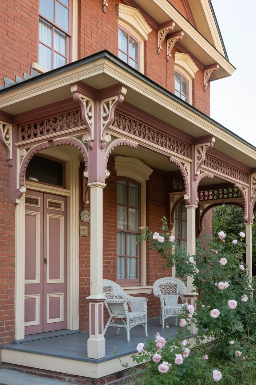
Dusty rose trim on a Victorian red brick home is an exterior colors for homes choice that fully embraces the inherent romanticism of both the architectural style and the material — it takes the warm red family of the brick and extends it in a softer, more feminine direction that suits the elaborate ornamental detailing of Victorian residential architecture beautifully. The dusty quality — gray-infused rather than pure pink — prevents the palette from reading as whimsical or saccharine, instead sitting comfortably in the sophisticated, historically appropriate register that Victorian homes demand from their color schemes.
Cream accents on window surrounds and porch columns provide the light relief that allows the dusty rose to register as a genuine design color rather than an overwhelming wash of pink across the facade. The tonal layering of warm red brick, soft dusty rose trim, and creamy white accents creates a palette of remarkable warmth and visual complexity that photographs beautifully and improves significantly with the addition of climbing roses and romantic garden planting. For exterior colors for homes where the architecture is rich with ornamental Victorian detailing, this palette is both historically appropriate and thoroughly beautiful — a color scheme that makes even passersby slow down to admire the facade.
16. Warm White Trim With Coastal Blue Shutters
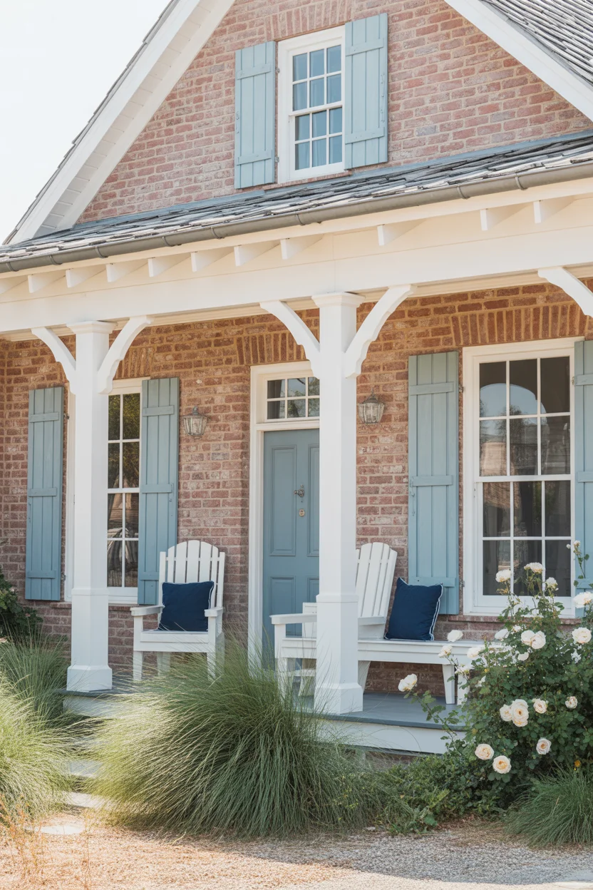
Warm white trim with coastal blue shutters brings the relaxed, sea-washed aesthetic of coastal New England architecture to red brick homes in any location — it’s an exterior colors for homes combination with strong regional character that nevertheless travels beautifully beyond its geographic origins because the palette itself is fundamentally appealing. The warm white trim plays its familiar role of defining architectural elements and brightening the facade, while the coastal blue shutters introduce a color that references sky, sea, and summer in a single stroke. Against warm red brick, that blue reads as refreshingly cool and distinctly coastal.
The specific tone of coastal blue matters significantly — it should be soft, slightly faded, and weather-influenced rather than bright or saturated, reflecting the bleaching quality of sea air and salt spray that gives authentic coastal architecture its distinctive color character. Think of the blue that wooden lobster buoys or old Cape Cod shutters develop after a decade of coastal exposure — muted, beautiful, and deeply evocative of a specific place and way of life. This exterior colors for homes combination suits colonial, cape cod, shingle style, and transitional residential architecture with particular ease and creates a curb appeal that feels genuinely relaxed, welcoming, and thoroughly beautiful in every season.
17. Chocolate Brown Trim With Amber and Gold Accents
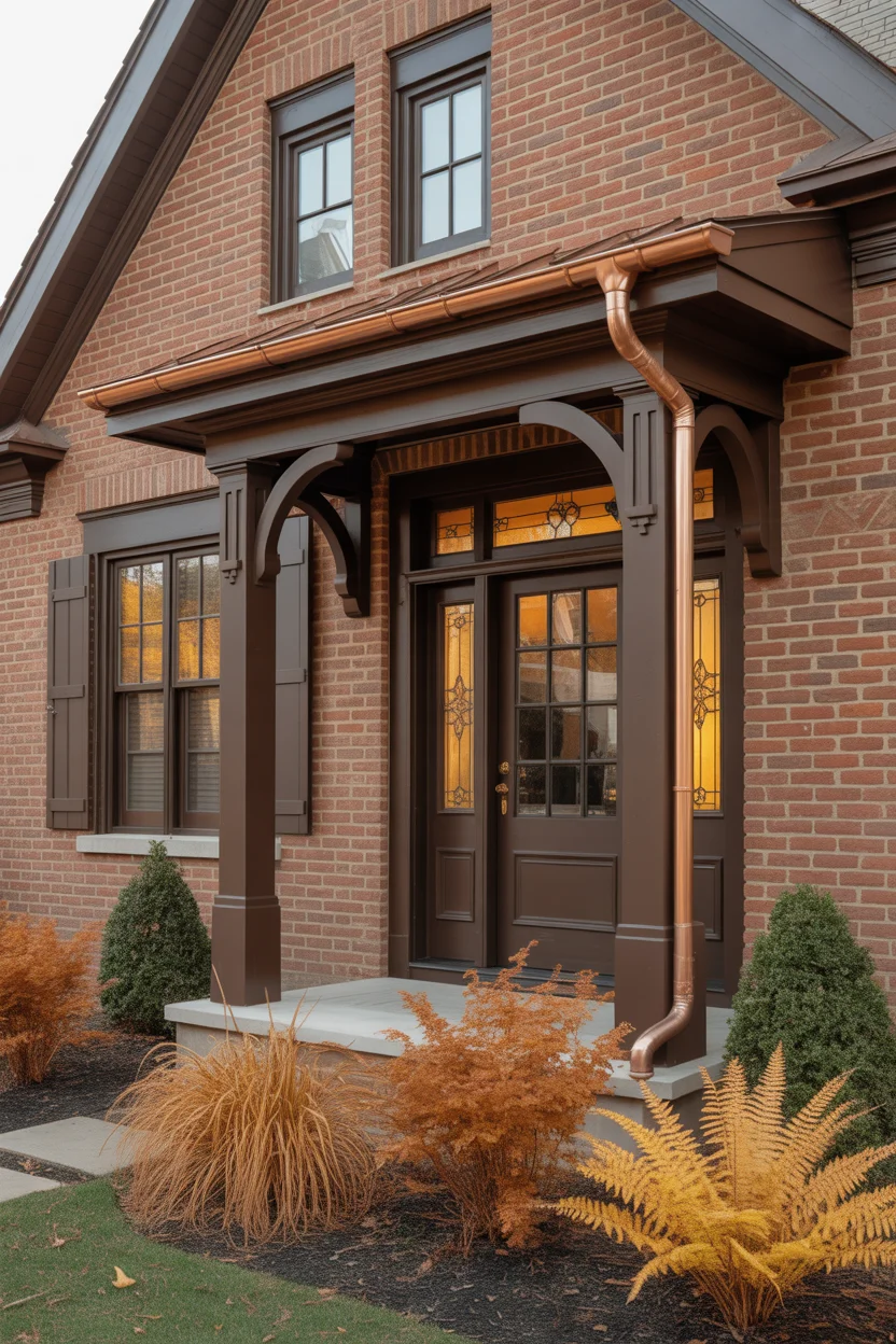
Chocolate brown trim creates one of the most naturally harmonious exterior colors for homes relationships with red brick — both materials sit in the warm brown-red color family and share an affinity for natural, organic aesthetics that makes their combination feel instinctively right. Brown trim never fights with brick the way that mismatched cool or overly bright colors can — instead it deepens and enriches the overall warm palette, making the brick appear more saturated and more beautiful. On craftsman bungalows, where natural materials and warm earth tones are fundamental to the architectural character, chocolate brown trim is arguably the most authentically appropriate choice.
Amber and gold accents complete the palette with warm metallic highlights that reference the craftsman style’s love of hand-crafted detail and quality hardware. Art glass sidelights in amber tones, bronze door hardware, and copper gutter downspouts allowed to develop their natural verdigris patina create a facade with genuine material richness and artisanal quality. These metallic and glass accents catch light at different times of day and create the impression of a home that has been assembled with care and genuine design knowledge. For exterior colors for homes with craftsman, arts and crafts, prairie style, or mission revival architecture, this warm brown and amber palette is an extraordinary choice that honors the tradition beautifully.
18. Pale Yellow Trim With White Accents and Green Shutters
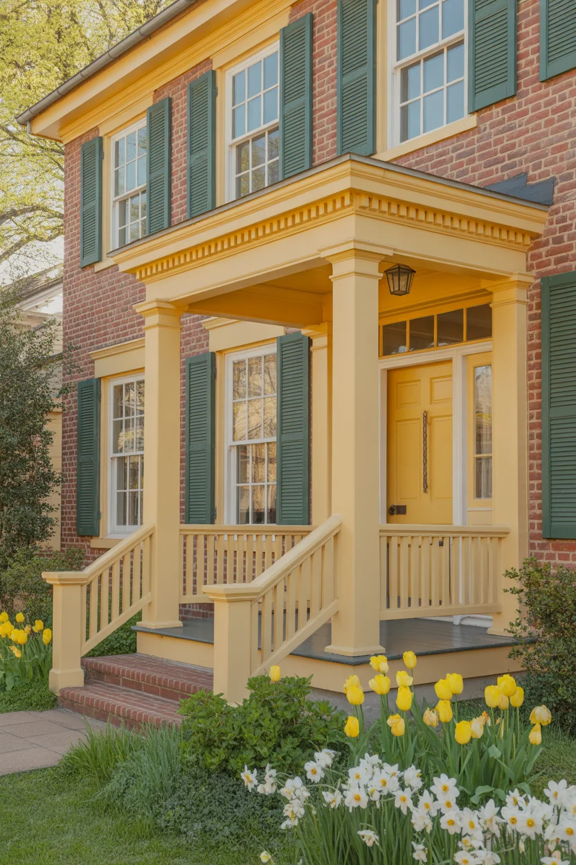
Pale yellow trim against red brick is the exterior colors for homes choice that brings the most outright warmth and happiness to a facade — it is a palette that practically radiates welcome, sunny and generous in a way that cooler, more restrained combinations deliberately avoid. The pale yellow picks up the warmest undertones in red brick — the orange and amber notes that sit within the masonry — and amplifies them through the painted trim in a way that makes the whole facade feel lit from within. It’s a color combination that looks spectacular in spring and summer sunshine and remains cheerful even on gray winter days.
The forest green shutters introduce the complementary color relationship that gives this cheerful palette its design credibility — without a strong contrasting element, pale yellow and red brick can drift toward sweetness that lacks sophistication. Green shutters anchor the palette, reference the surrounding garden, and create the visual tension that makes the yellow and brick reading feel energetic rather than gentle. White porch railings and columns provide the clean architectural clarity that defines the colonial structure, and the slightly deeper golden yellow of the front door gives the entry point a warm, concentrated focal quality that draws visitors toward it naturally. This exterior colors for homes combination is simply joyful — and joy is an entirely valid design objective.
19. Greige Trim With Matte Black Windows and Doors
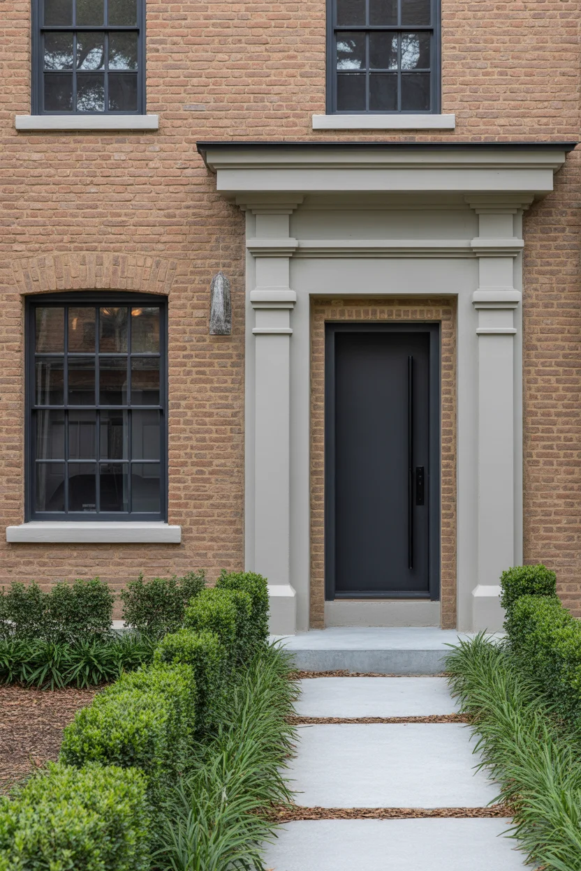
The combination of greige trim with matte black steel windows and doors applies the language of contemporary architecture to a traditional red brick home with genuinely exciting results — it creates an exterior colors for homes palette that reads as a renovation of intelligence and sophistication, one that respects the permanence and warmth of the existing brick while updating the overall character of the facade dramatically. Matte black steel-framed windows have become one of the most significant architectural details in contemporary residential design, valued for their graphic precision and their ability to transform the appearance of any home they’re introduced to.
The greige trim mediates between the warm brick and the cool black windows, sitting in the middle of the temperature spectrum and creating a calm, consistent field against which both the brick and the black metal elements read clearly. This intermediate tone prevents the contrast between warm brick and cool black from becoming too stark or jarring, maintaining visual harmony while still allowing the dramatic character of the black windows to register fully. For homeowners with traditional red brick homes who desire a contemporary update that doesn’t require demolition or reconstruction, this exterior colors for homes combination is one of the most transformative and architecturally convincing available.
20. Soft Lavender Trim With White and Gray Accents
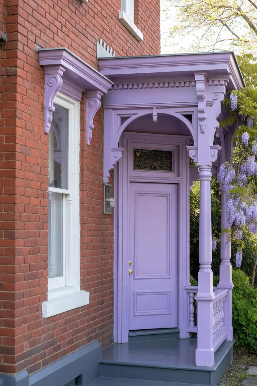
Soft lavender trim on a Victorian red brick home occupies a design space that is genuinely rare — it’s a exterior colors for homes palette with unmistakable personality and genuine charm, one that makes the home look like a place where something interesting, creative, or romantic is happening inside. Lavender against red brick creates a color relationship that is unexpected but entirely harmonious — both tones share a warmth and vibrancy that makes them natural companions, and the soft gray undertones within lavender prevent any clash with the brick’s warm red family. This combination has an almost literary quality — it belongs on the home of an artist, a gardener, or a poet.
Wisteria climbing the porch is the natural accompaniment to lavender trim that makes this palette feel completely inevitable — the purple flower clusters echo the trim color so perfectly that it appears designed rather than coincidental. In bloom, the wisteria transforms the lavender-trimmed facade into something of extraordinary beauty. Out of bloom, the architectural vine structure and soft gray bark add texture and an established, permanent quality that suits Victorian residential architecture with perfect authenticity. For exterior colors for homes where the design goal is beauty, personality, and a genuine sense of romantic individuality, soft lavender trim delivers all three in extraordinary abundance.
21. Dark Teal Trim With Natural Stone Accents
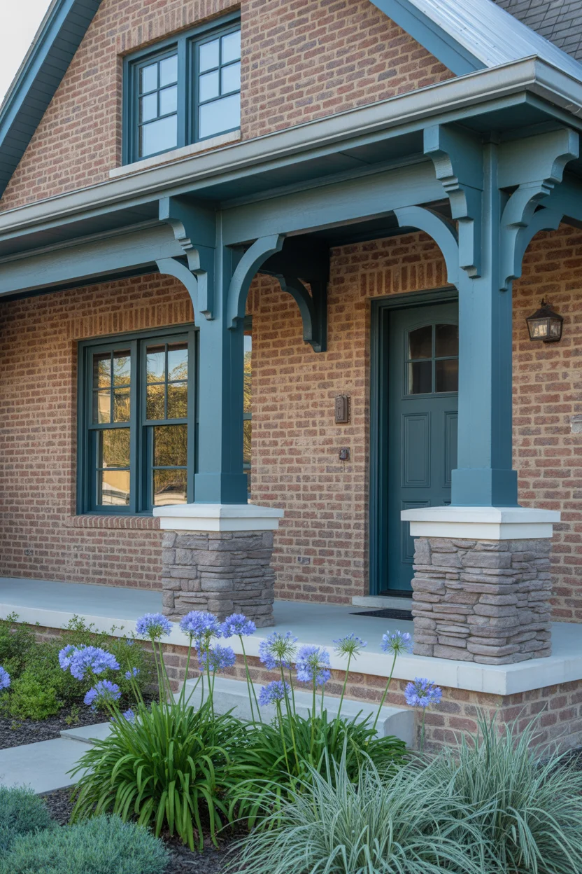
Deep teal trim creates one of the most visually powerful and color-sophisticated exterior colors for homes combinations with red brick — the relationship between teal’s blue-green character and brick’s warm red creates a complementary tension that makes both colors appear more vivid and more beautiful than either achieves in isolation. Teal is a complex color that shifts between green and blue depending on light conditions and surrounding tones, which means a teal-trimmed red brick home looks slightly different — and consistently beautiful — at different times of day and in different seasons.
Natural stone veneer accents on porch pillars and foundation zones introduce a third material that bridges the warmth of the brick and the cool sophistication of the teal trim — natural stone carries both warm and cool tones simultaneously, making it an ideal mediating material between brick and a cool-toned paint color. The combination of three natural-toned materials — brick, stone, and teal-painted timber — creates an exterior with genuine material richness and textural depth that purely painted facades cannot approach. For exterior colors for homes with craftsman, prairie, or transitional architectural character, dark teal trim with natural stone accents produces an exterior of outstanding beauty and complexity.
22. Off-White Trim With Rust Orange Shutters and Door
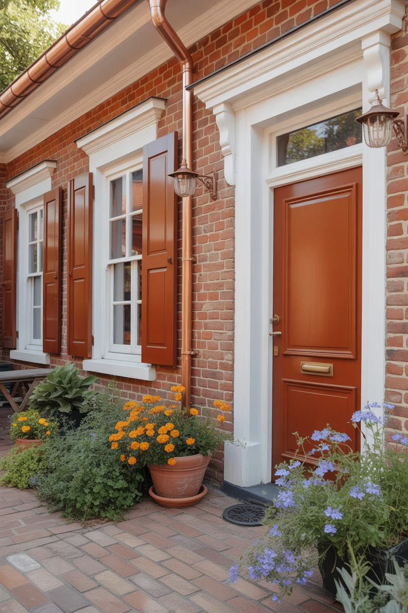
Off-white trim with rust orange shutters and door is an exterior colors for homes combination that fully celebrates and amplifies red brick’s inherent warm character rather than providing conventional contrast against it. The rust orange shutters and door pick up the most orange and terracotta notes within the brick and intensify them through the saturated, warm-toned paint, creating a facade of extraordinary warmth that radiates energy and personality. This is not a palette for the timid — it commits fully to warmth, earthiness, and Southern European color confidence — but for homes with the right architectural character, it is absolutely glorious.
The off-white trim rather than pure white is a critical choice in this palette — pure white would create too much contrast with the warm orange-red story being told by the brick and shutters, creating a jarring brightness that disrupts the palette’s warmth. Off-white with a yellow or cream undertone, by contrast, sits comfortably within the warm color family while still providing the definition and brightness that trim needs to function architecturally. Copper downspouts allowed to develop their natural verdigris patina introduce cool green accents that prevent the palette from becoming monotonously warm. For exterior colors for homes with cottage, Mediterranean, or Spanish colonial character, this is one of the most joyful and beautiful combinations imaginable.
23. Light Gray Trim With Blush Pink Accents and Rose Gold Hardware
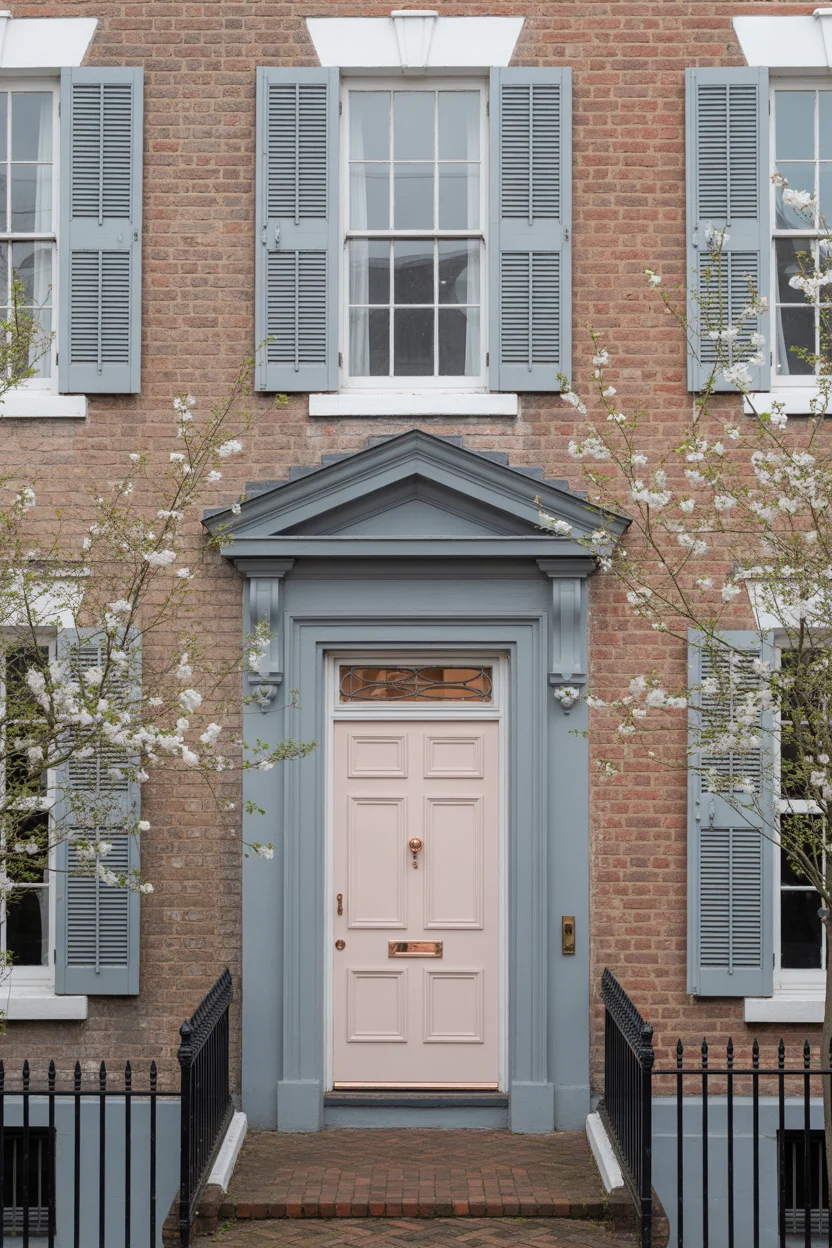
Light gray trim on a red brick Georgian home creates an exterior colors for homes palette of restrained, classical elegance — the cool gray provides perfect architectural definition without introducing any color that might compete with the brick’s natural warmth or the facade’s formal symmetrical composition. Georgian architecture is defined by its rigorous symmetry, refined proportions, and the quality of its classical detailing, and light gray trim respects all of those priorities by providing a neutral, precise framework that allows the architecture itself to be the primary design statement. It is the most architecturally selfless of all trim color choices.
The blush pink front door is the palette’s most surprising and most enchanting element — a barely-there color that registers as feminine, refined, and quietly confident rather than decorative or whimsical. Against the cool gray trim and warm red brick, the soft blush pink creates a three-tone conversation of warmth, coolness, and delicacy that is genuinely sophisticated. Rose gold hardware — a finish that sits between the warmth of copper and the neutrality of silver — completes the palette with metallic accents that harmonize with all three tones simultaneously. For exterior colors for homes where the design goal is refined, grown-up beauty with just enough unexpected charm to make the facade truly memorable, this light gray and blush pink combination is a perfect and thoroughly original choice.
Conclusion
Choosing the right exterior colors for homes with red brick doesn’t have to feel intimidating — it just requires understanding what the brick is already telling you. Whether you lean toward the drama of midnight black, the romance of dusty rose, or the timeless authority of navy and white, the right palette is the one that genuinely moves you. Test your favorites in natural light, commit with confidence, and let your home’s true character finally shine.

Join The Discussion